


CASE STUDY | Visual Identity
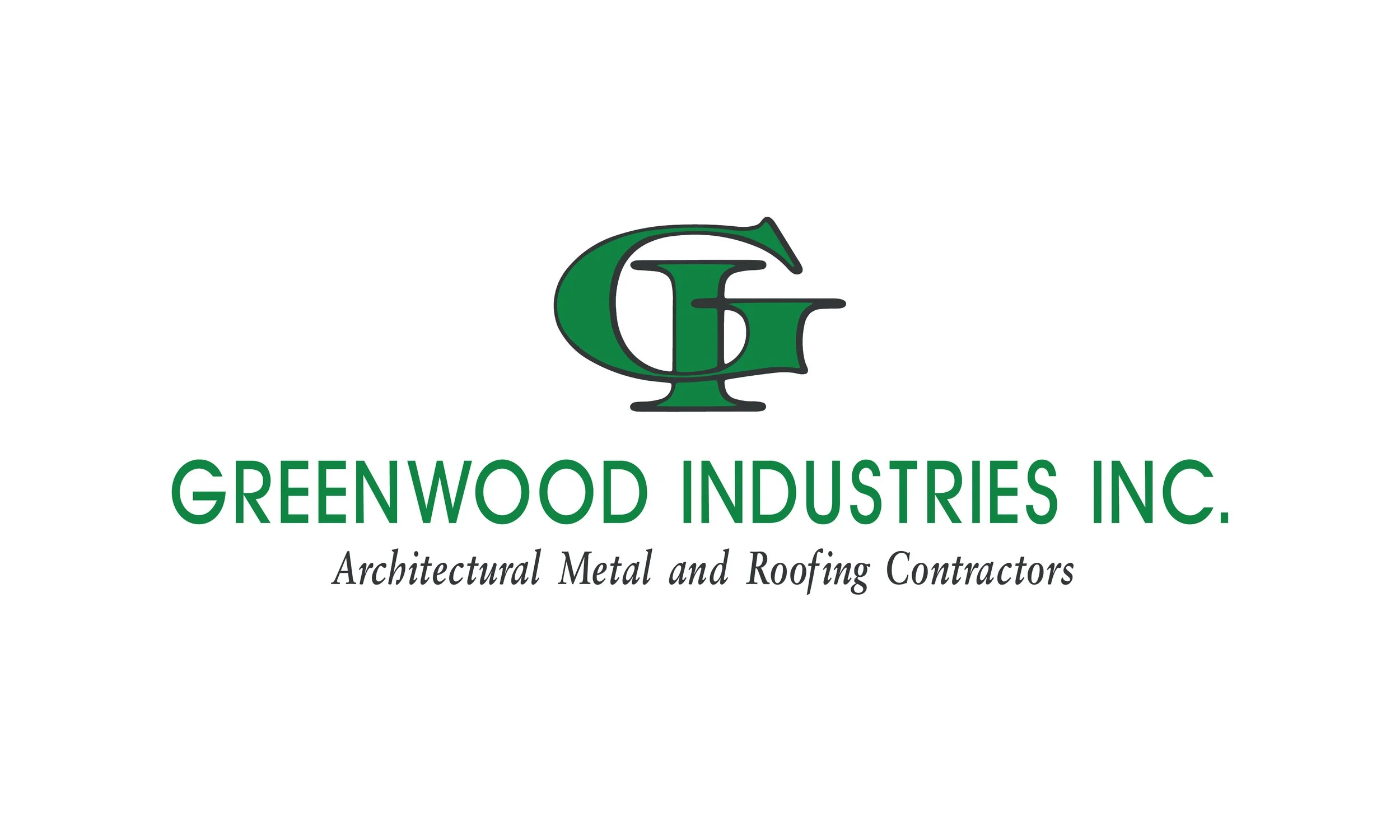
Greenwood Industries
Established in 1992, Greenwood Industries is a privately held company that has grown into one of the top 10 commercial roofing and building envelope contractors in the United States. Headquartered in Worcester, Massachusetts, the company operates 15 locations throughout the Northeast.
Greenwood’s success has been built largely through repeat business from many of the region’s most respected general contractors, architects, engineers, and building owners. Through strategic acquisitions of like-minded companies, Greenwood has continued to expand its reach while adding talented teams to the organization.
The Maintenance Division
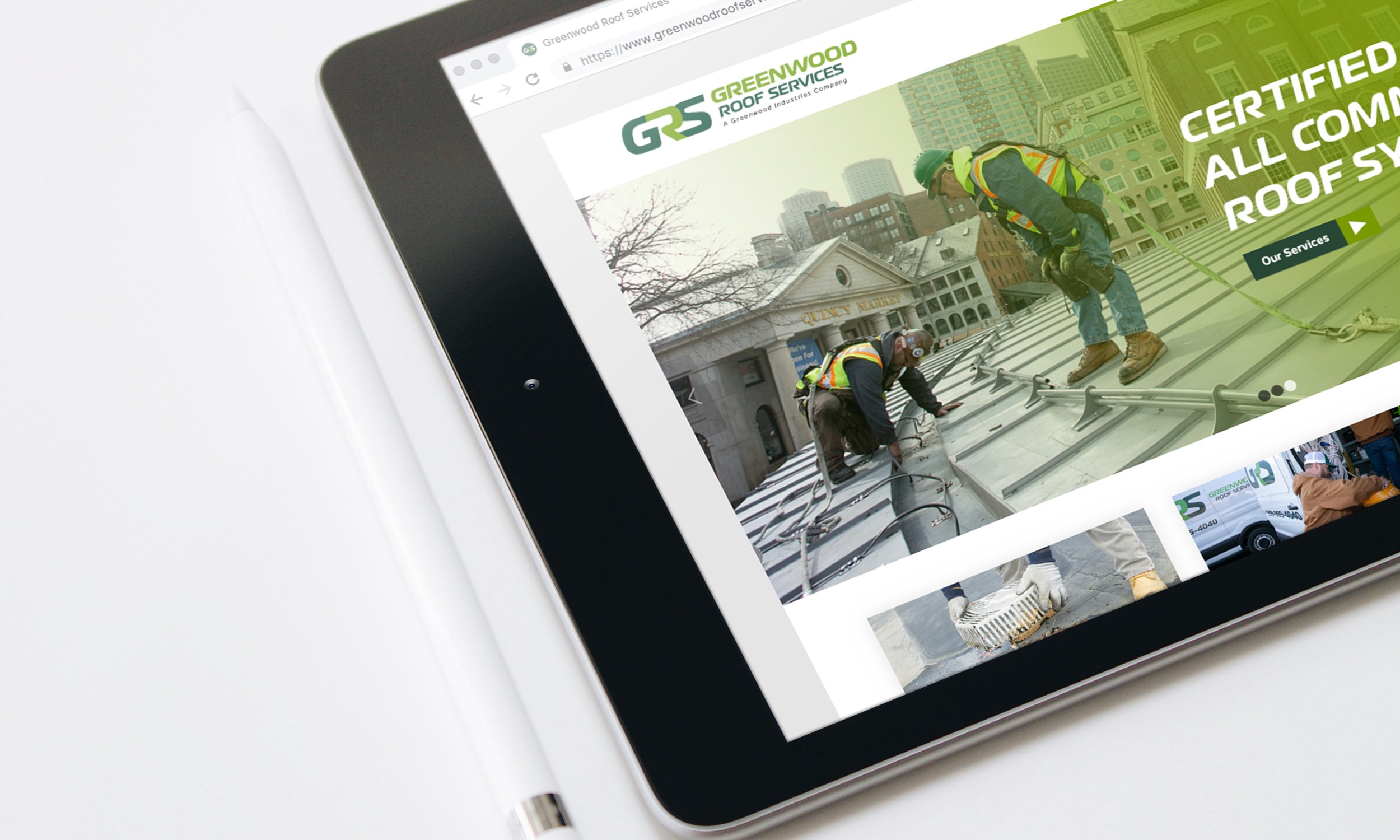
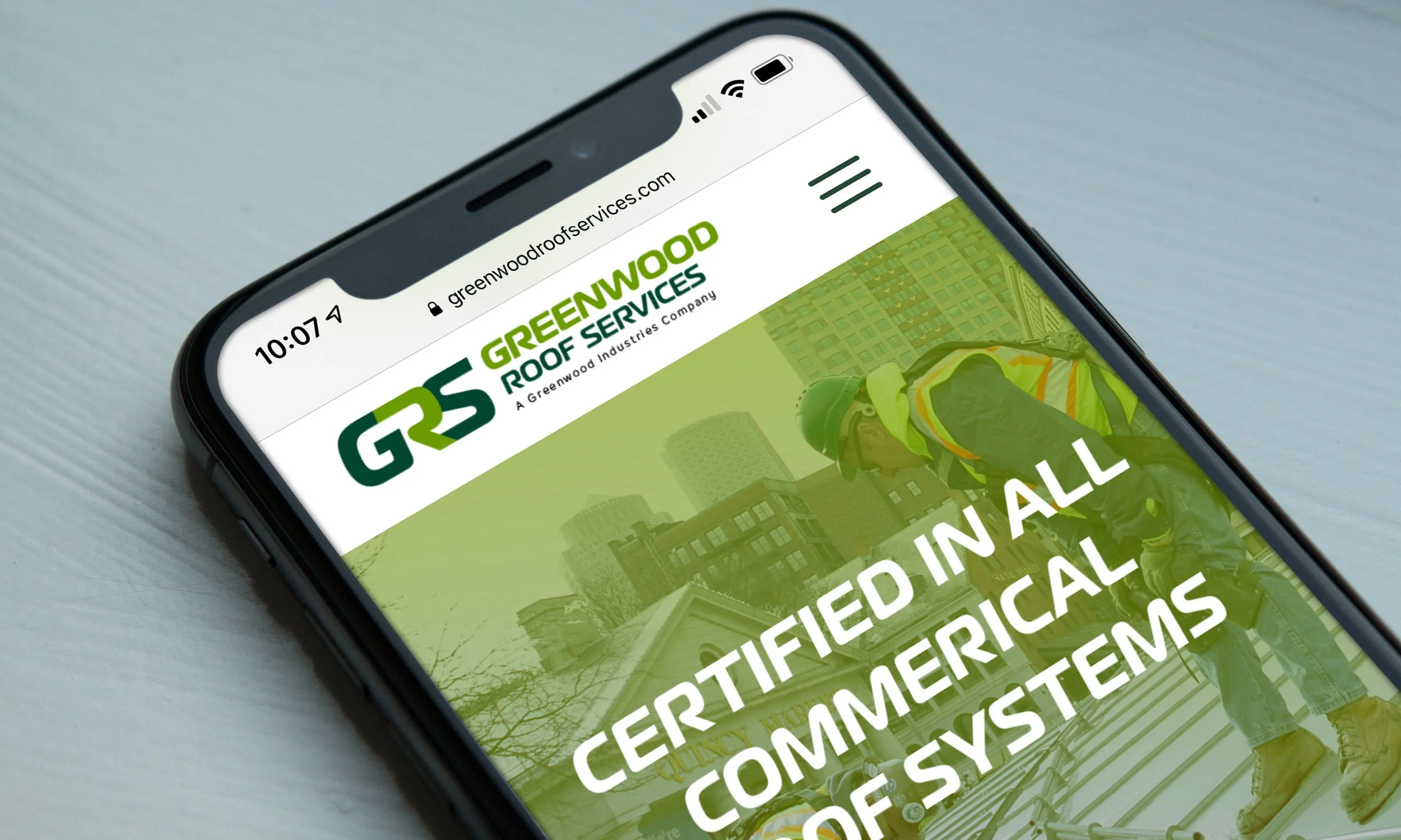
My work with Greenwood began when the company sought to promote its rapidly growing Maintenance Division, which lacked a strong visual identity and market presence. The division’s Vice President believed that creating a dedicated logo and website would help accelerate growth and increase visibility.
While early discussions with leadership explored the possibility of taking a broader approach to the company’s overall visual brand, there was a strategic urgency to focus first on the Maintenance Division.
A Broader View
Sometimes design must demonstrate its value before it is fully embraced. Following the successful launch of the GRS logo and website, company leadership revisited earlier conversations about a complete rebrand.
Working alongside Greenwood’s newly formed in-house marketing team, we identified several key challenges:
Multiple acquisitions over the years had created a fragmented and inconsistent brand image.
The existing logo felt dated and no longer reflected the company’s scale or capabilities.
The hierarchy between divisions and affiliated companies created confusion.
The company needed a visual identity that felt strong, confident, organized, and representative of an industry leader.
Original Logo + Acquisitions
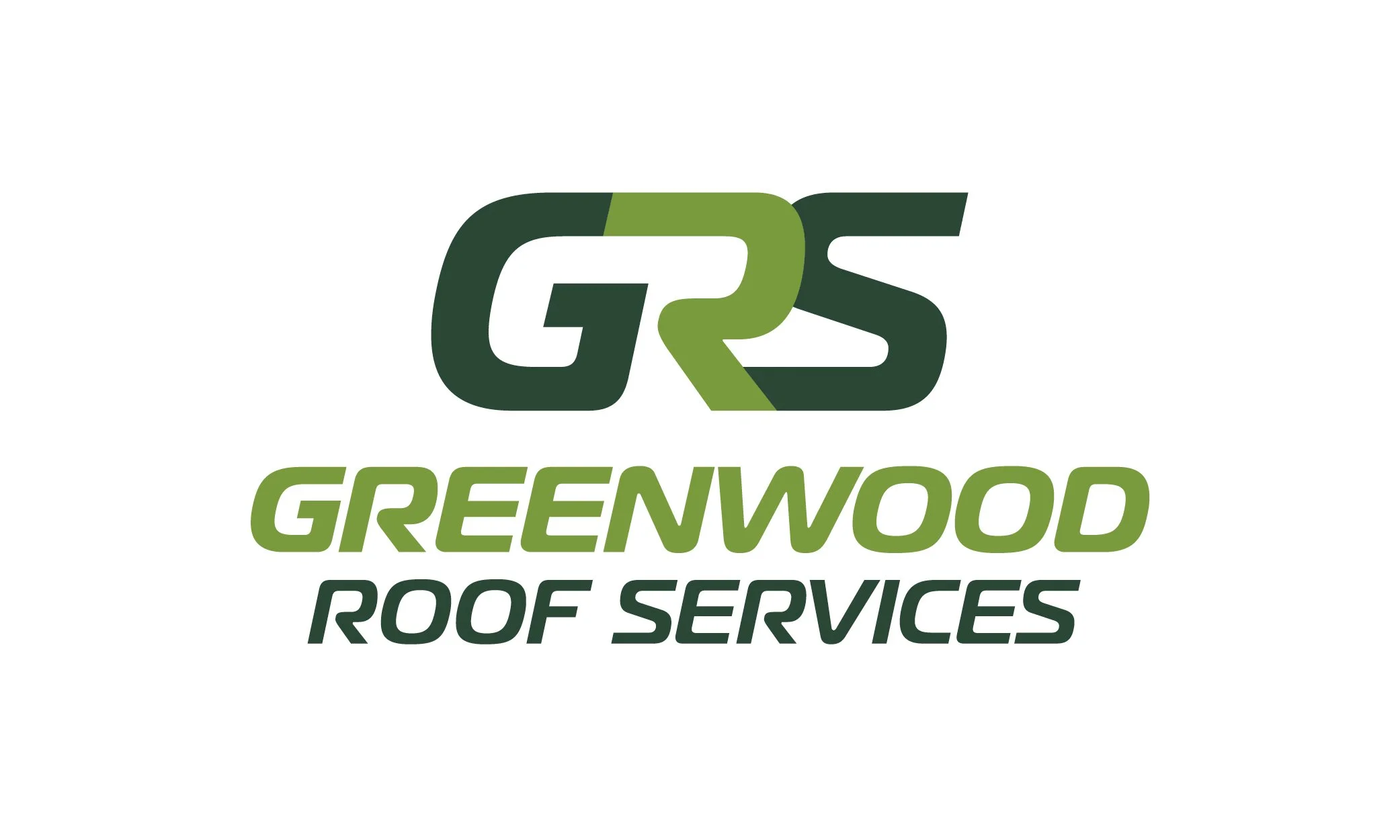
The New Logo
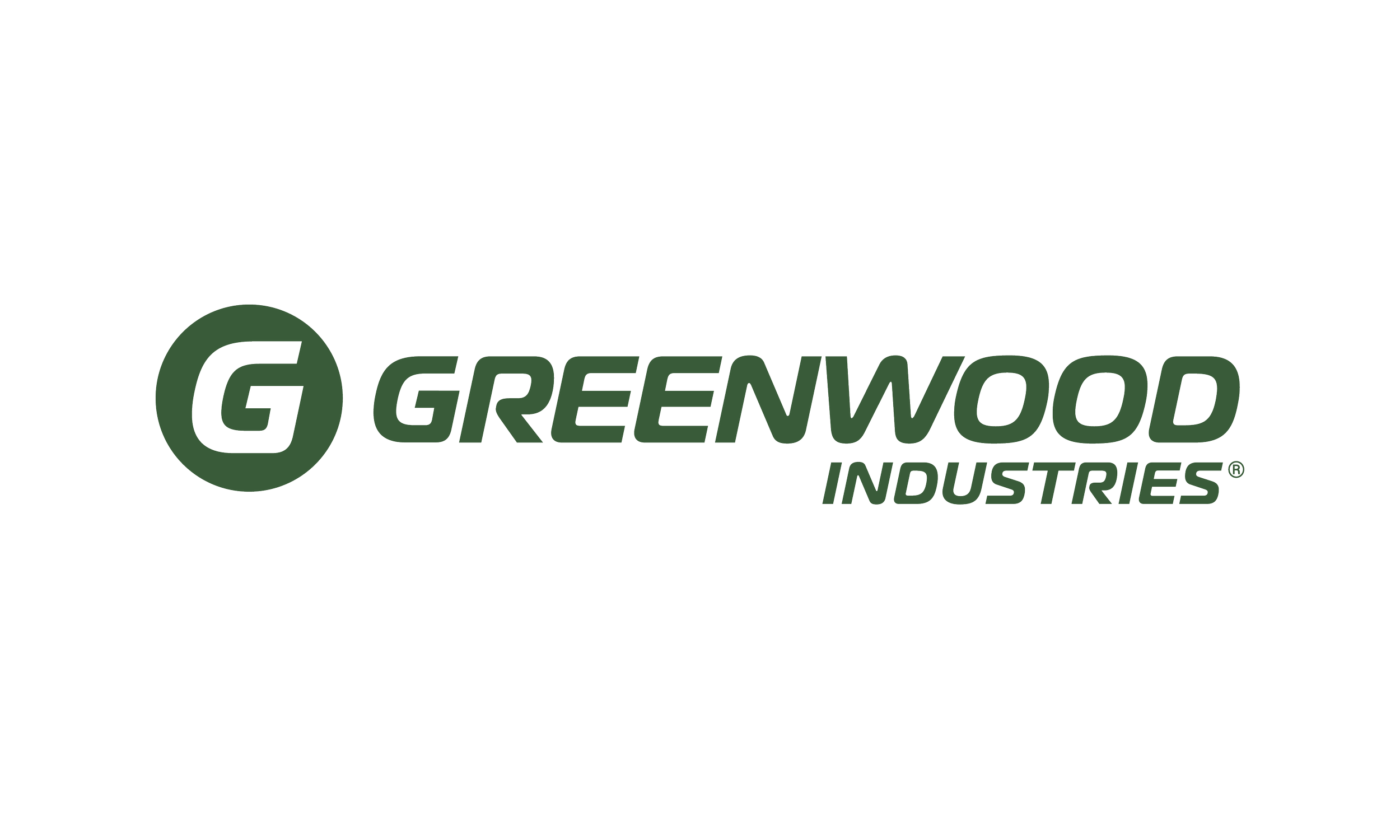
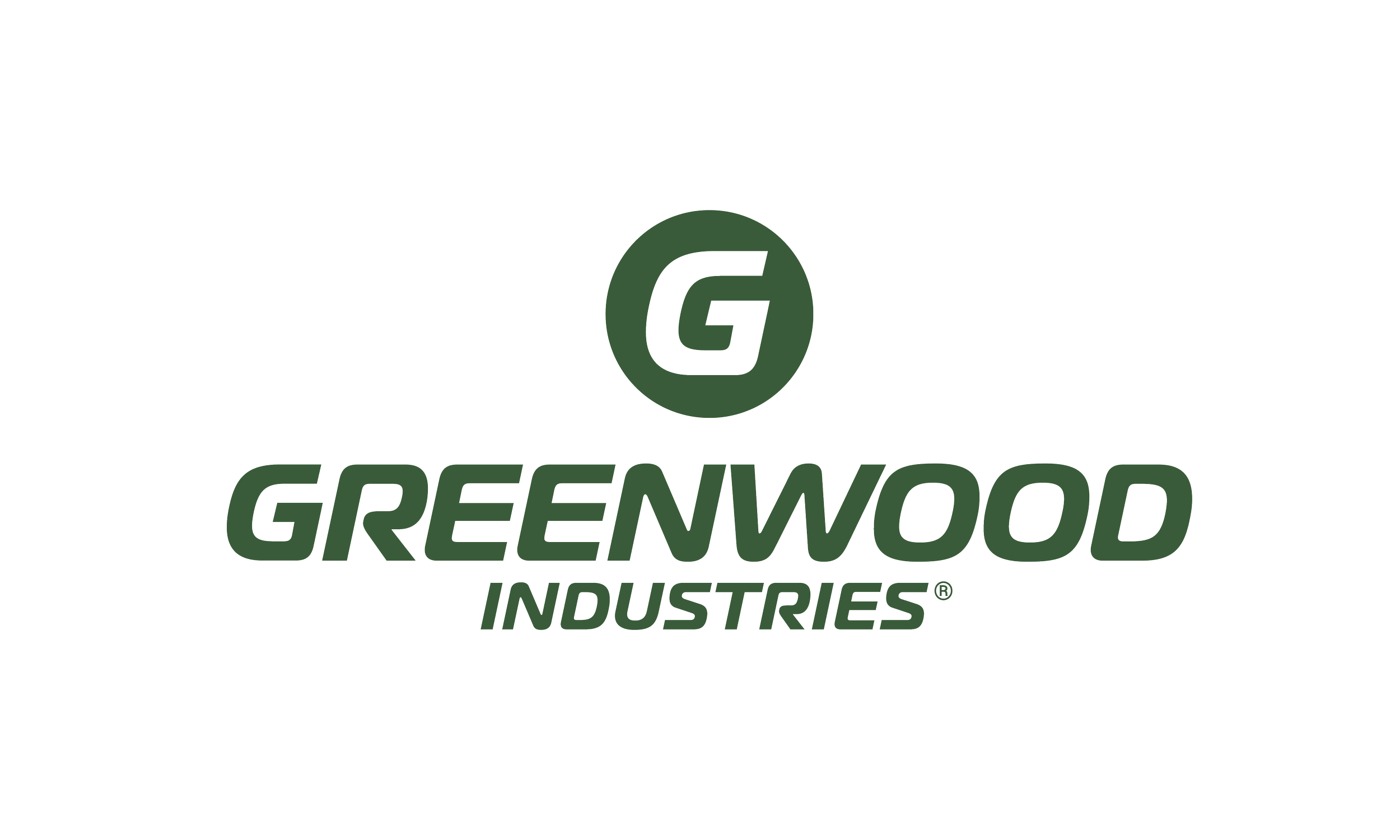
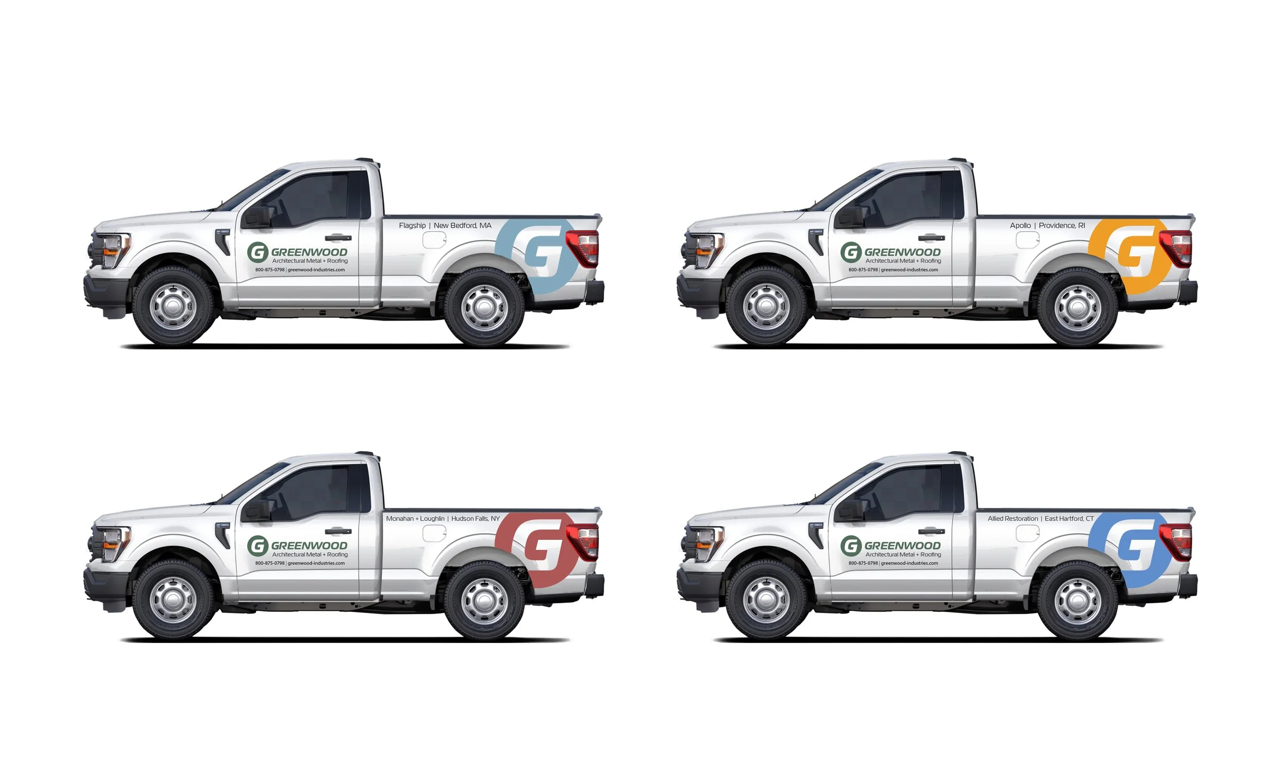
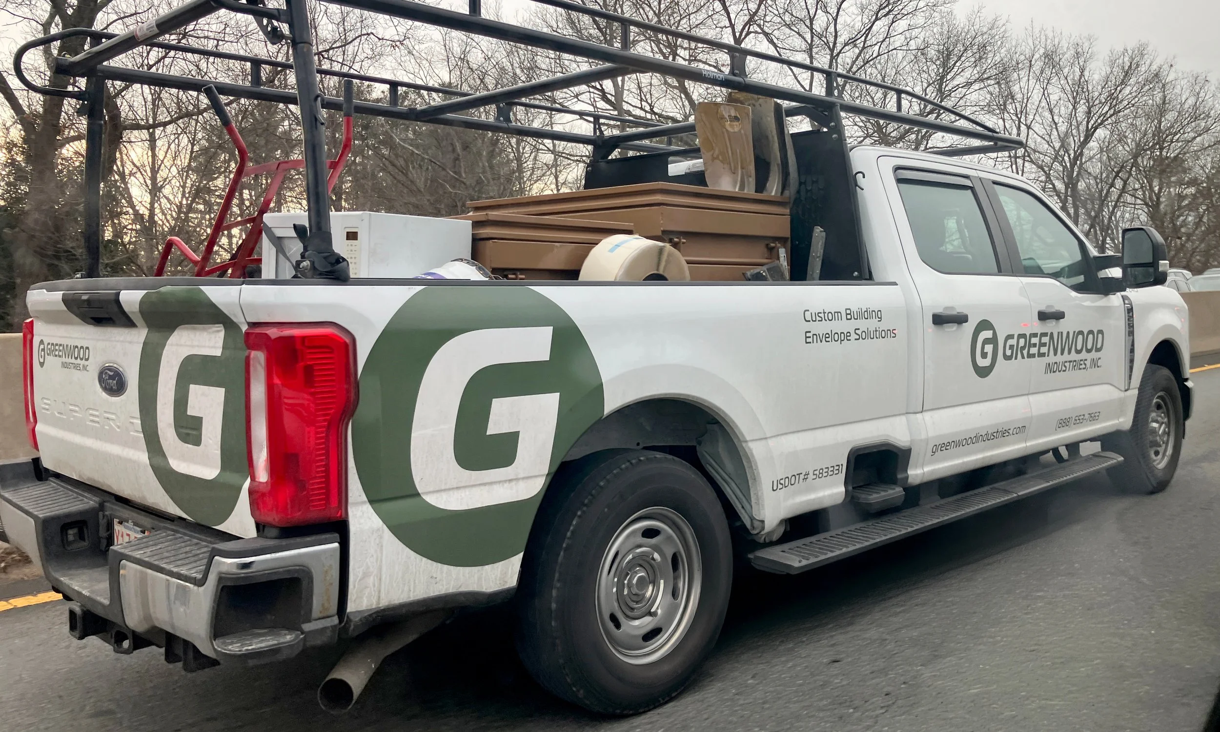
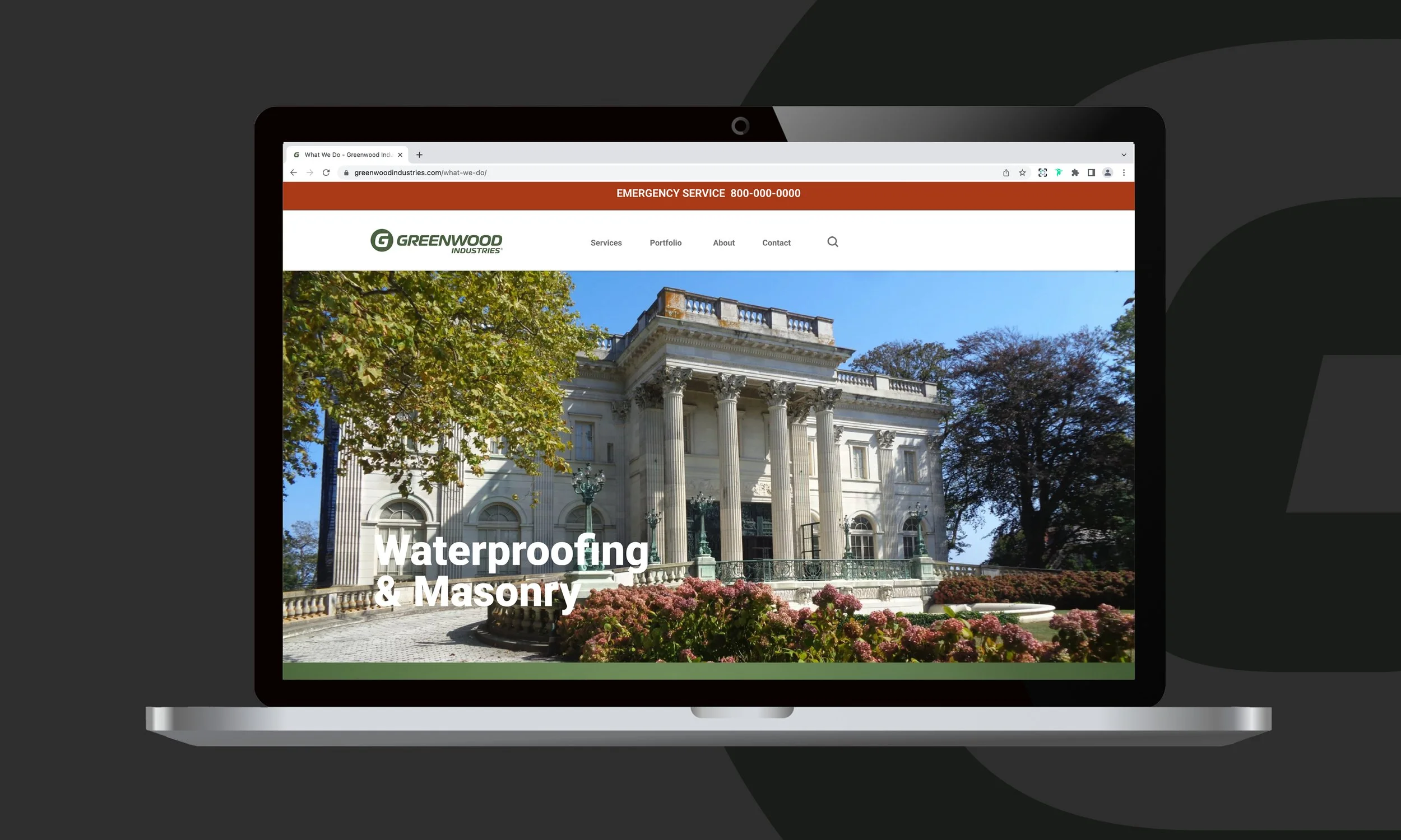
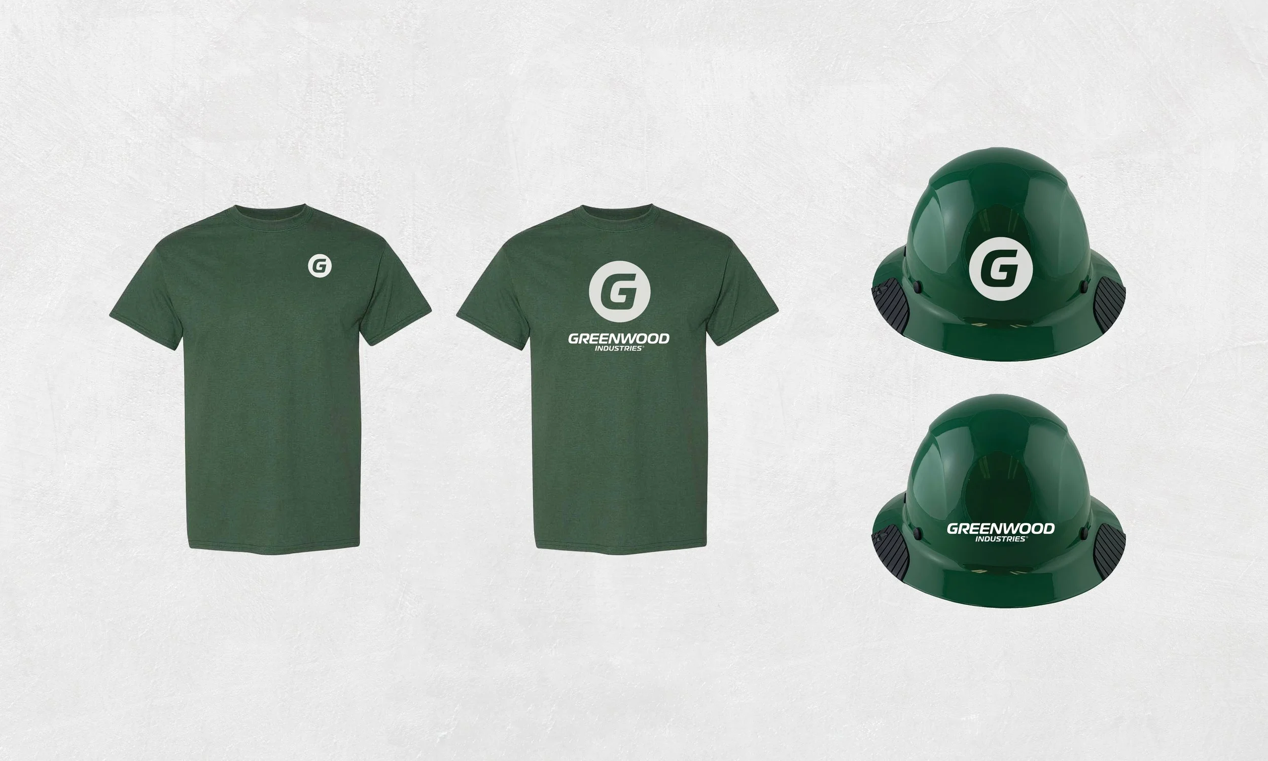
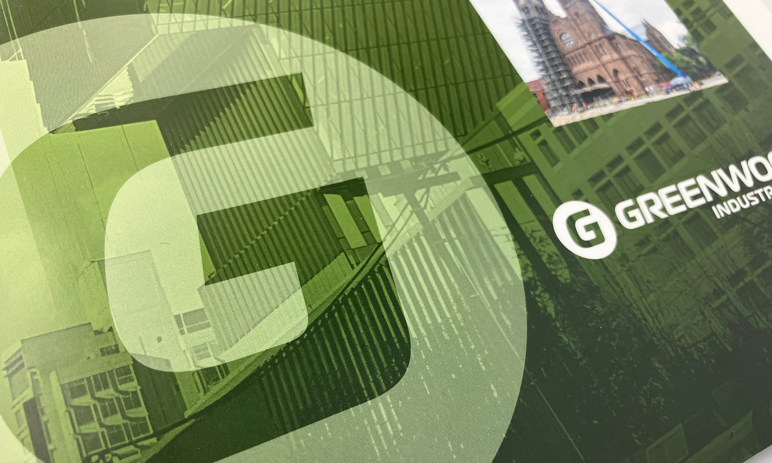
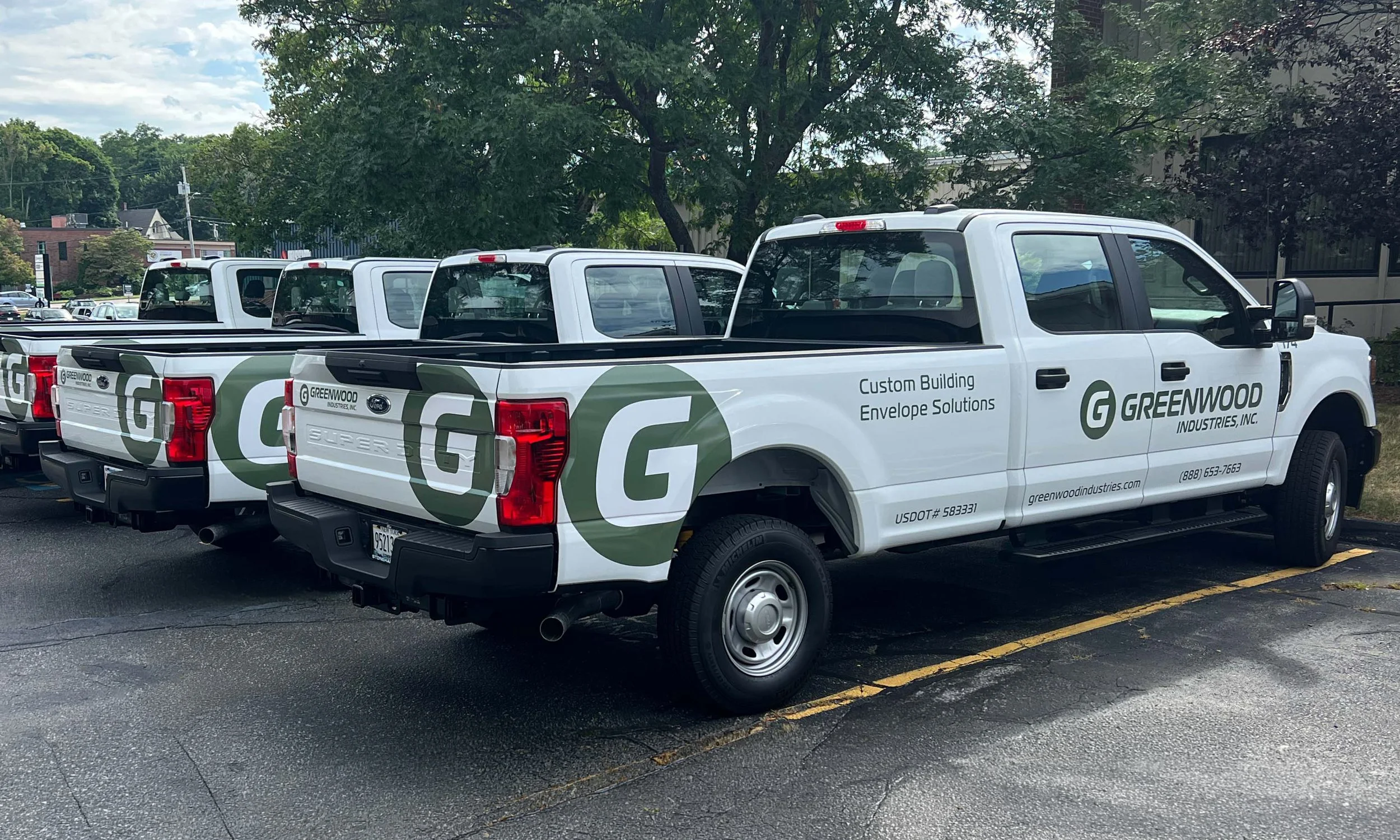
The new logo is fresh, clean, and modern, representing a company that continues to move forward. Designed with versatility in mind, the mark will be used across a wide range of applications including the company’s fleet of more than 100 vehicles, job sites, the website, signage, apparel, and additional branded materials.
These real-world applications will help communicate the full scope of Greenwood’s capabilities, allowing the logo itself to remain simple, bold, and highly recognizable. The streamlined design creates a strong visual presence while supporting a consistent and professional brand identity across every touchpoint.
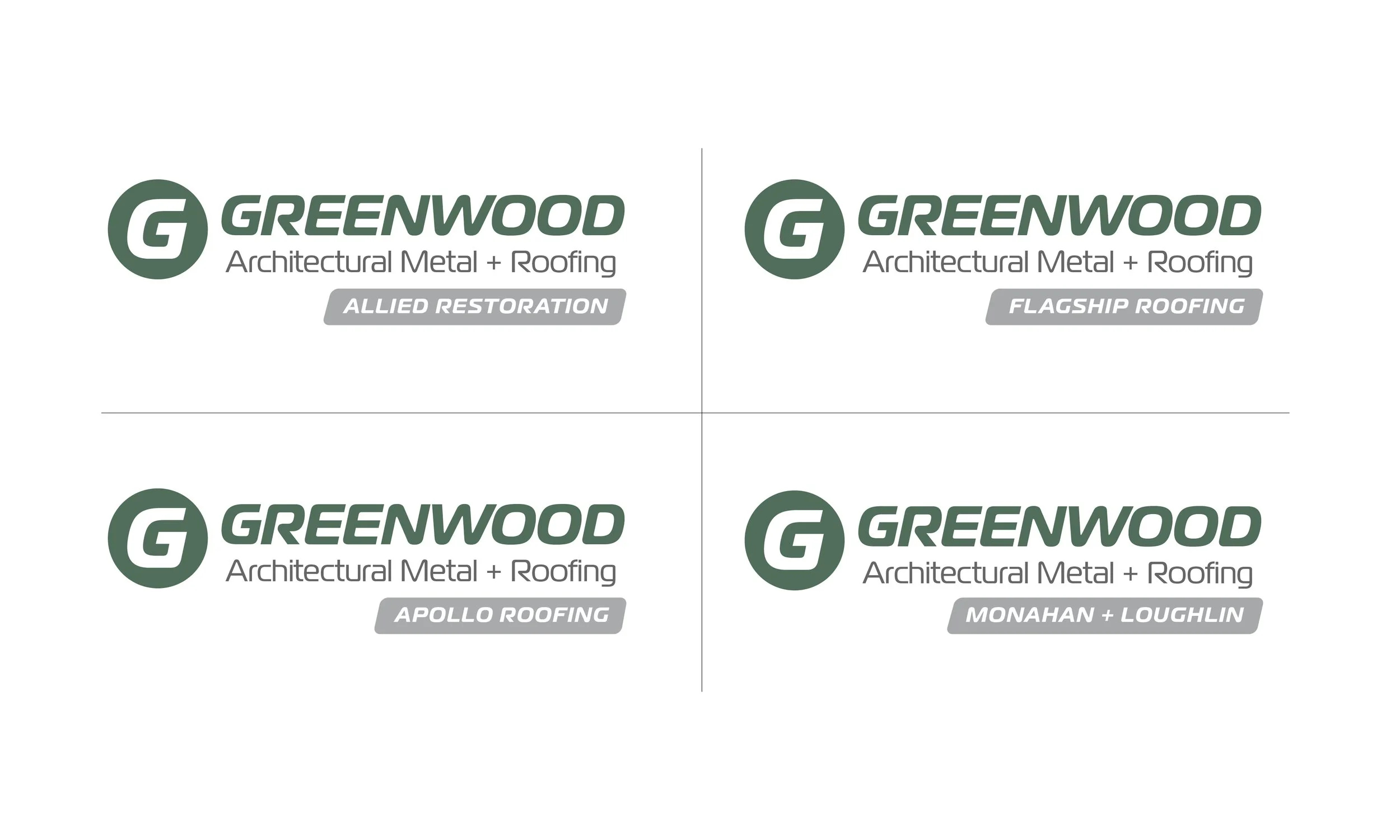
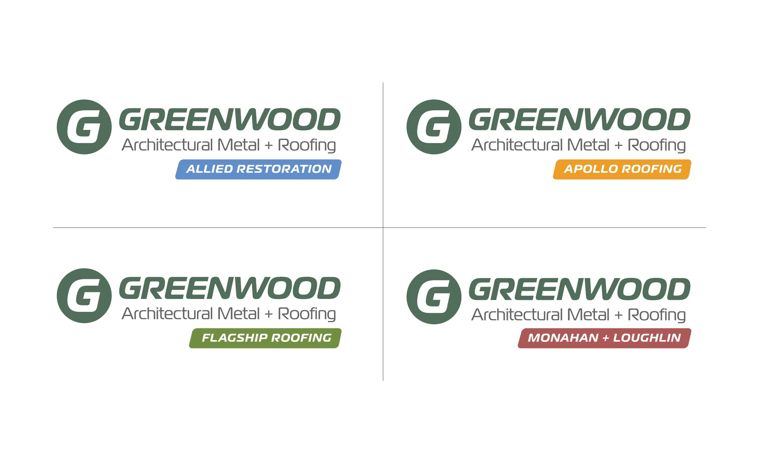
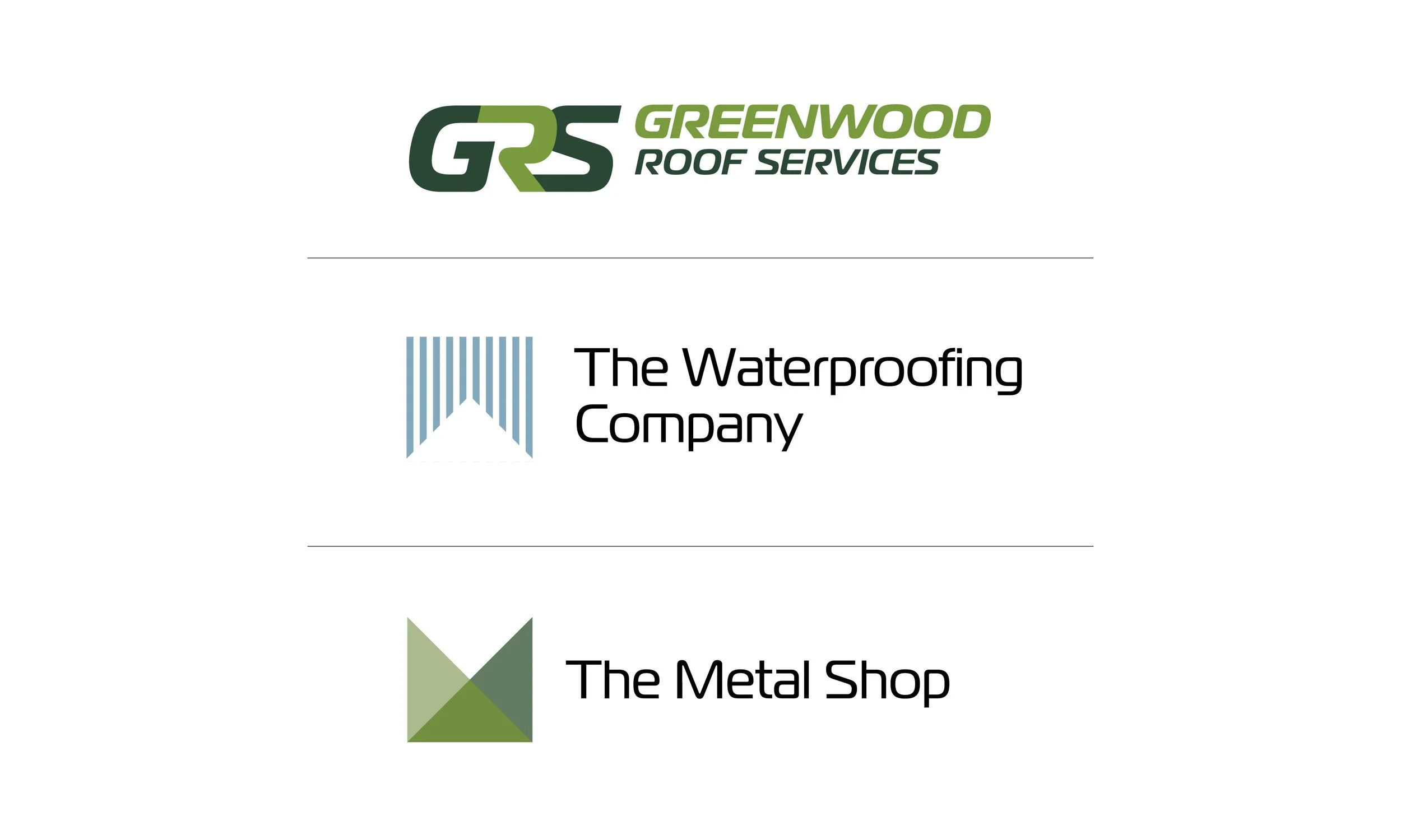
Several acquired companies had built strong regional recognition and credibility based on either geography or the quality of their work. This led to discussions about maintaining individual company names under the Greenwood umbrella.
These conversations initiated an exploration into how the companies could be presented visually while maintaining consistency within the broader Greenwood brand system.
Hierarchy Exploration
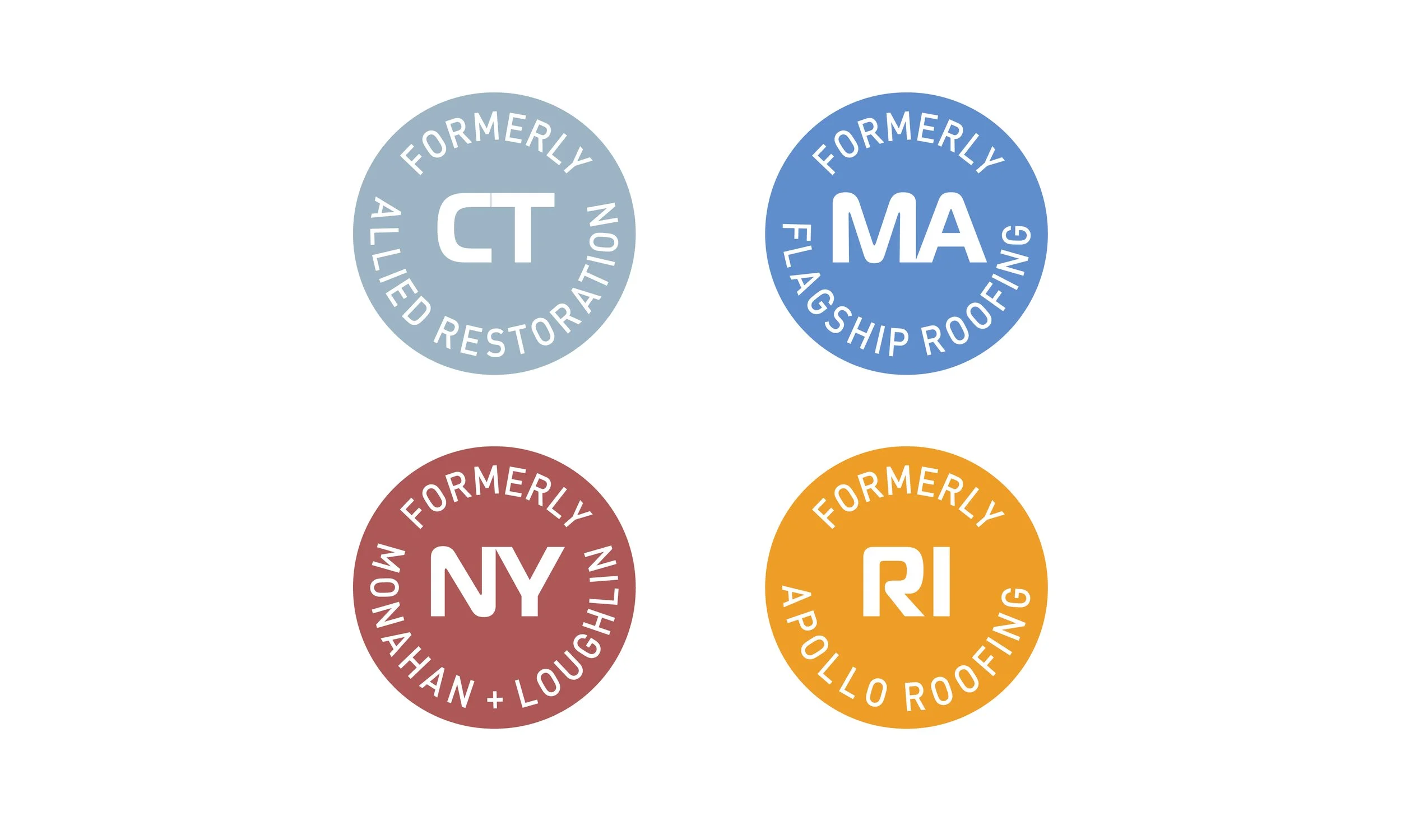
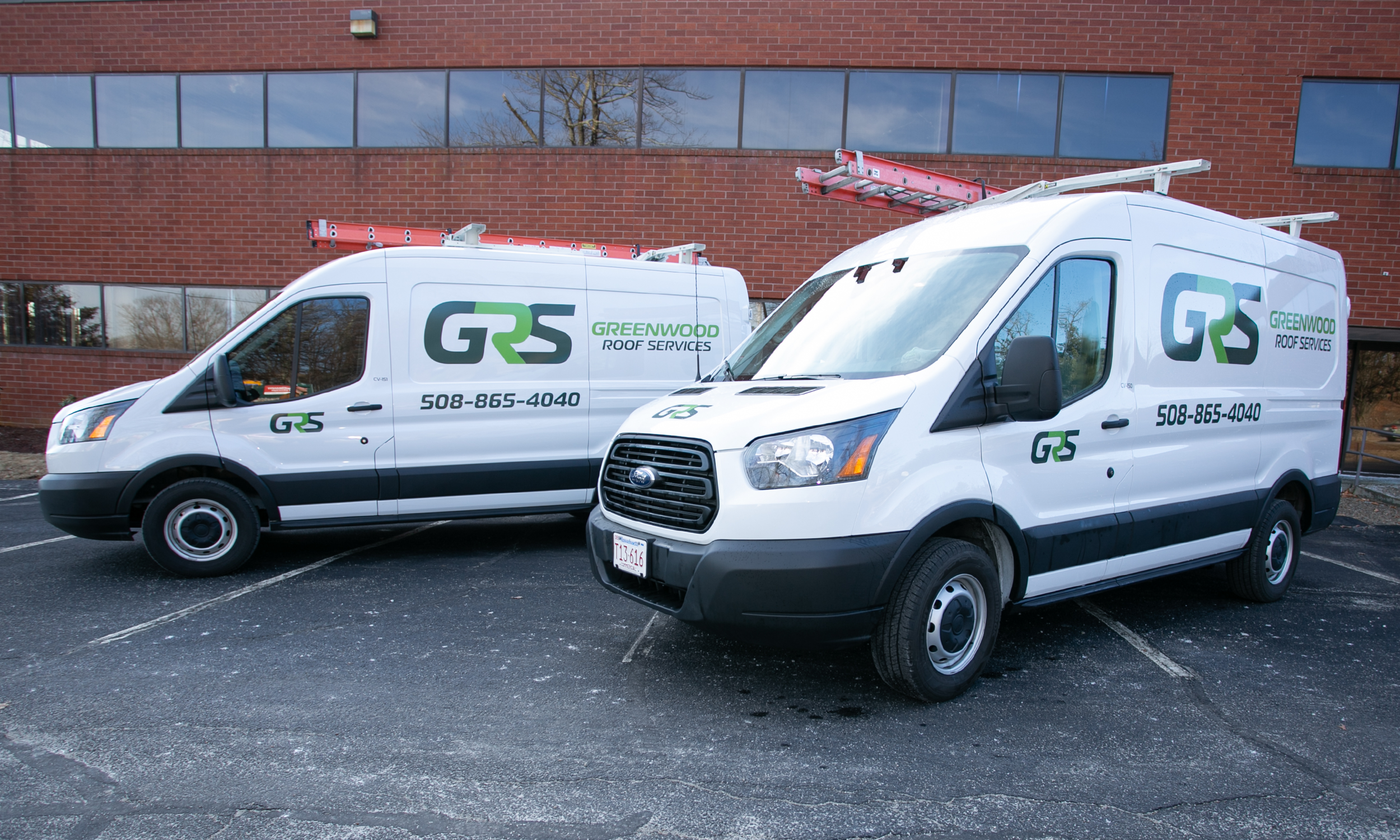
The company’s new head of marketing became a key advocate in guiding the project through completion. Ultimately, an executive decision was made to consolidate all future acquisitions under the Greenwood Industries name, significantly simplifying the brand structure and presentation.
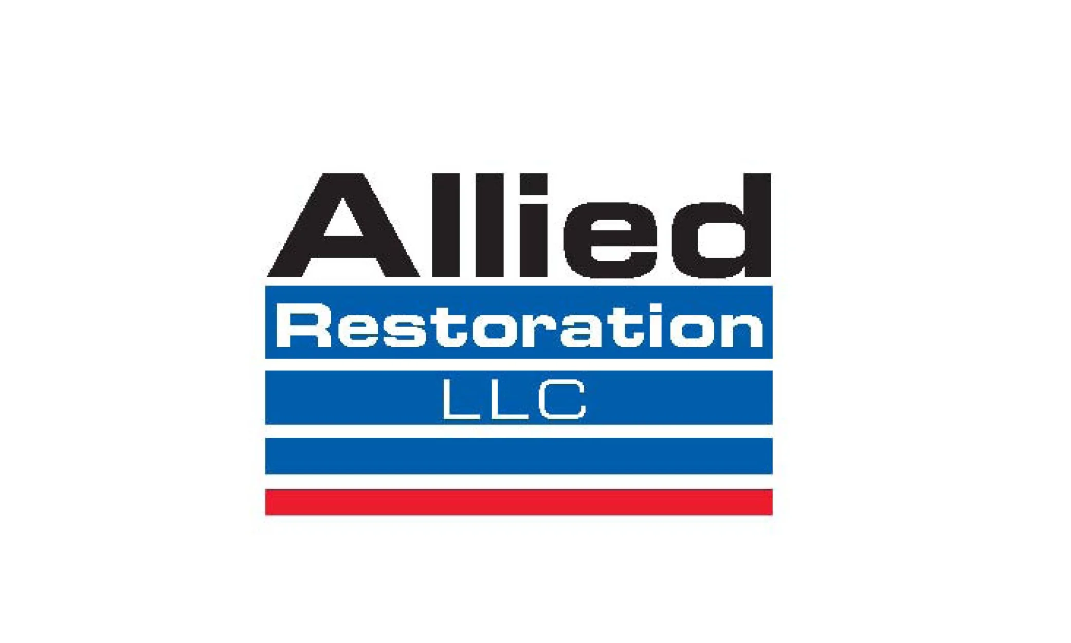
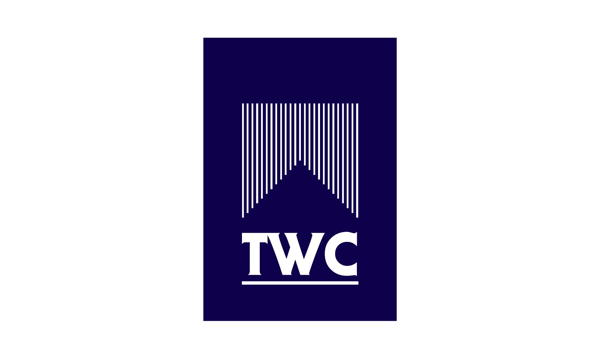
This approach left only a small number of affiliated businesses operating beneath the Greenwood name at the time, including Greenwood Roof Services and The Waterproofing Company.
During the process, we also identified a highly skilled internal team specializing in architectural and roofing-related metalwork. Their expertise — particularly in historic restoration projects — was exceptional, and we believed their work deserved to stand alongside the company’s other specialized divisions as part of the overall Greenwood brand family.
The Design Solution
What the client had to say
Casey Design truly operates as an extension of my internal team. Jim quickly picks up on the direction, tone, and priorities we establish and carries them seamlessly through his designs. In an environment where we are often asked to do more with less, Jim’s partnership makes my department feel deeper, stronger, and more experienced. Having him as part of our team elevates everything we produce.
Ginny Pitcher
Executive Vice President of Enterprise Strategy
Greenwood Industries