

CASE STUDY | Visual Identity
American Antiquarian Society
Founded in 1812, the American Antiquarian Society is a national treasure. Its unmatched collection of material printed in North America through 1876 is used by scholars from around the world and award-winning writers and filmmakers like Ken Burns, Jill Lepore, David McCullough, Nathaniel Philbrick, Laurel Ulrich and Alan Taylor.
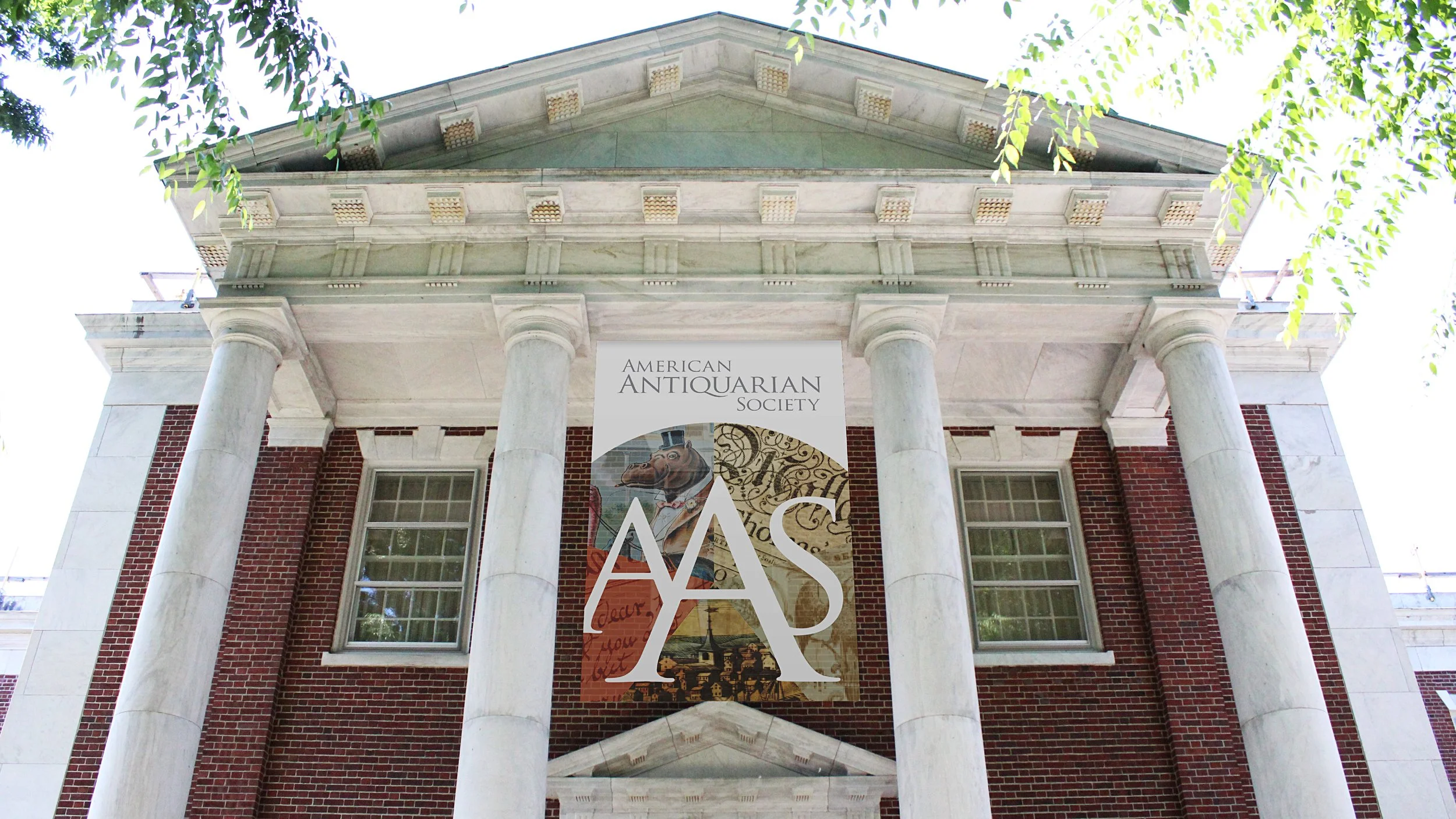
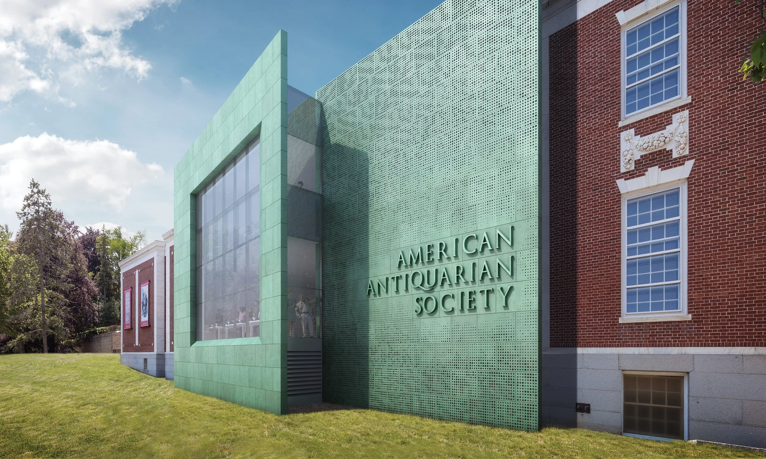
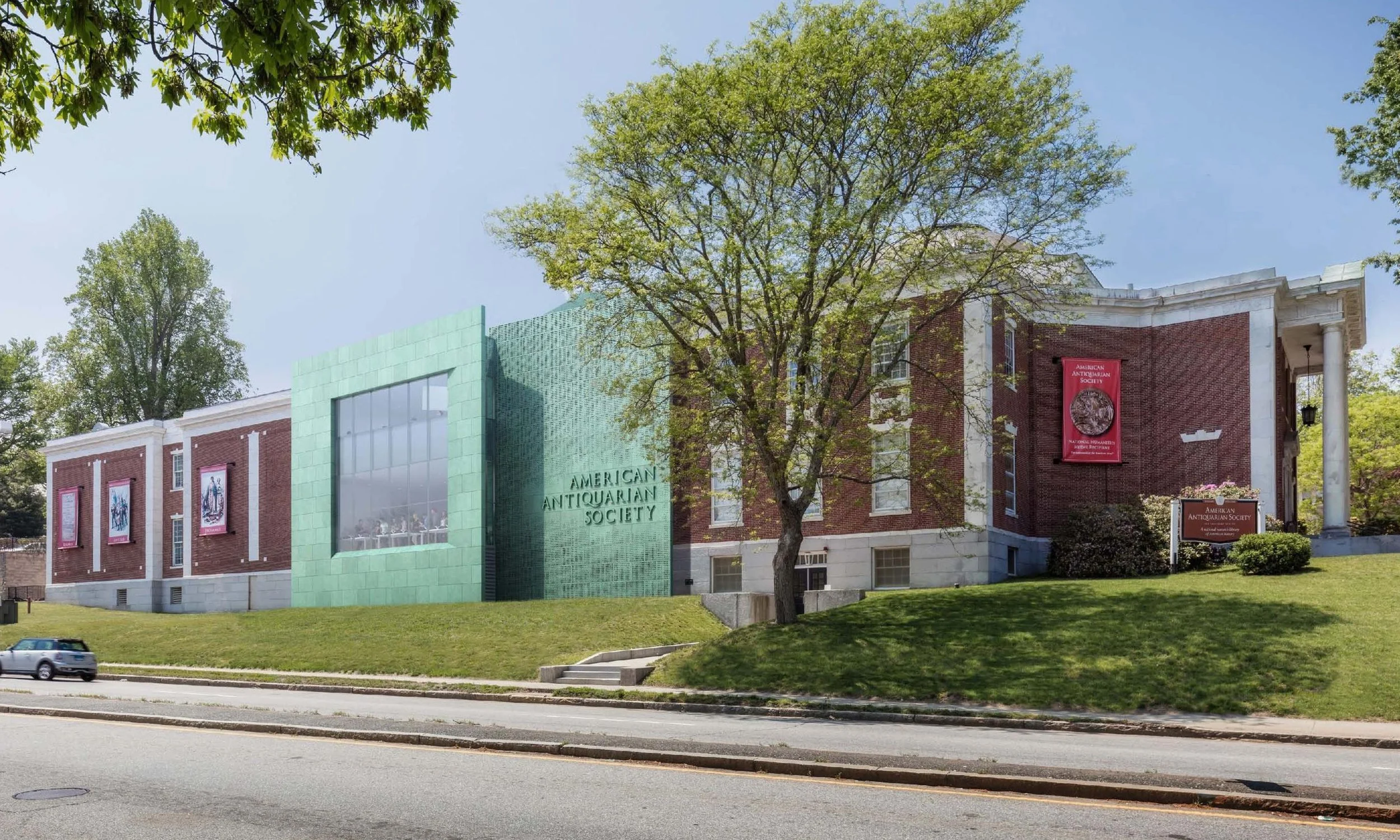
Yet the society realized its public profile was as opaque as the solid brick walls of its library. So, in the midst of a major expansion and renovation of its Worcester complex, the society asked us to develop a visual brand to engage the public. Working through a diligent process with the curatorial staff and leadership, we crafted a new image that evokes relevance and celebrates the historic mission of the society.

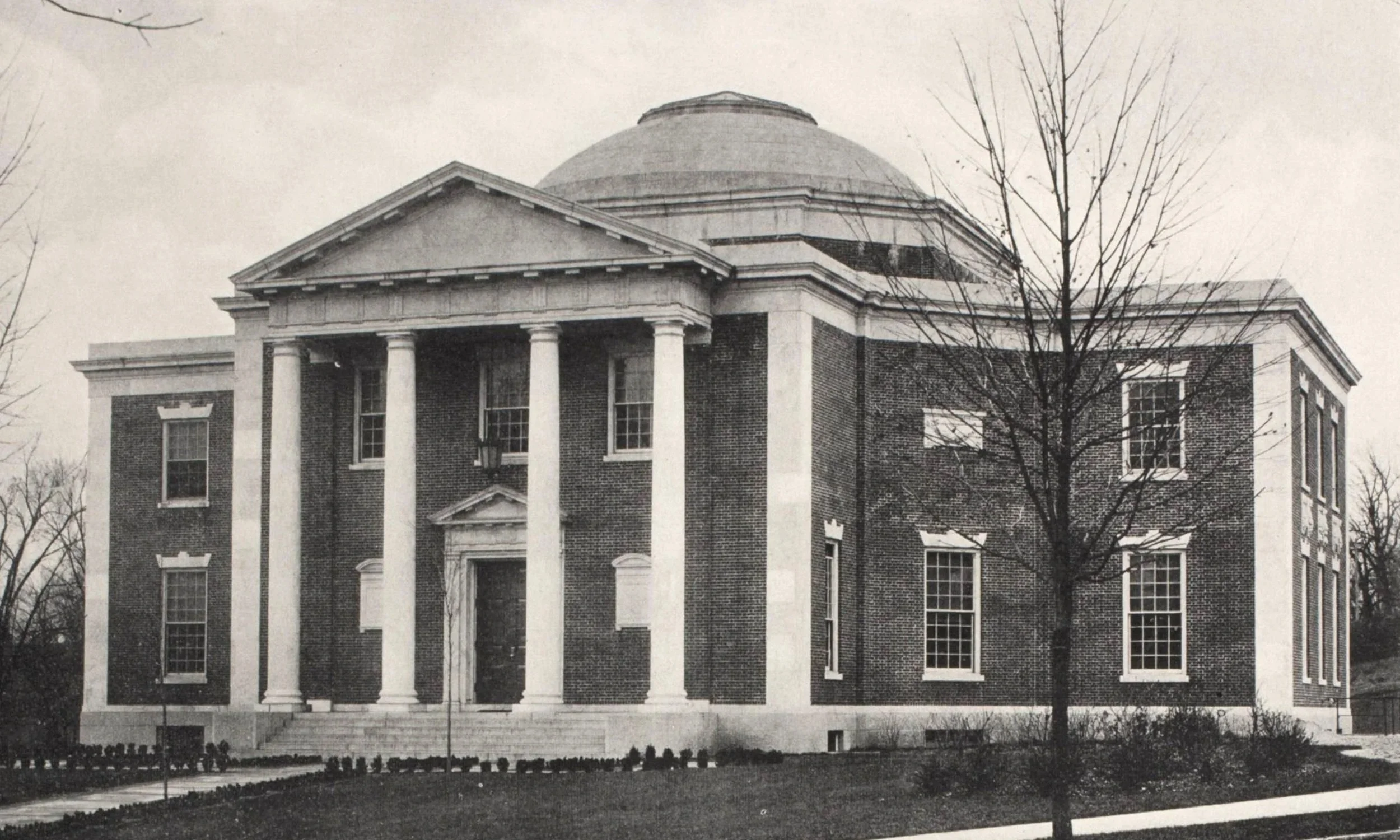
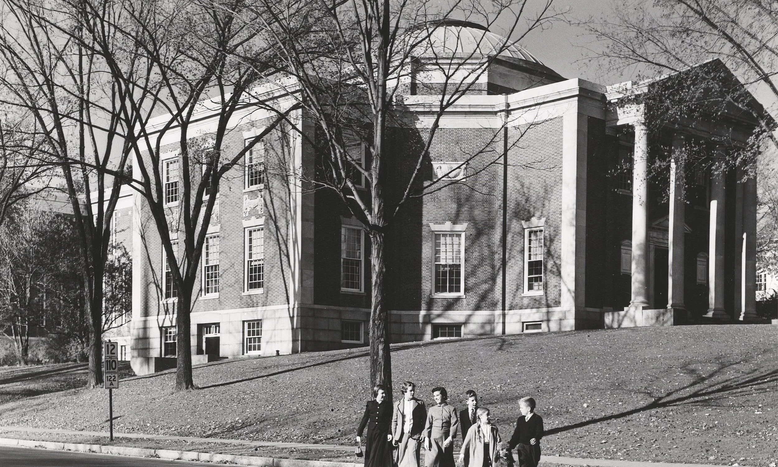
The dome above the reading room inside the American Antiquarian Society.
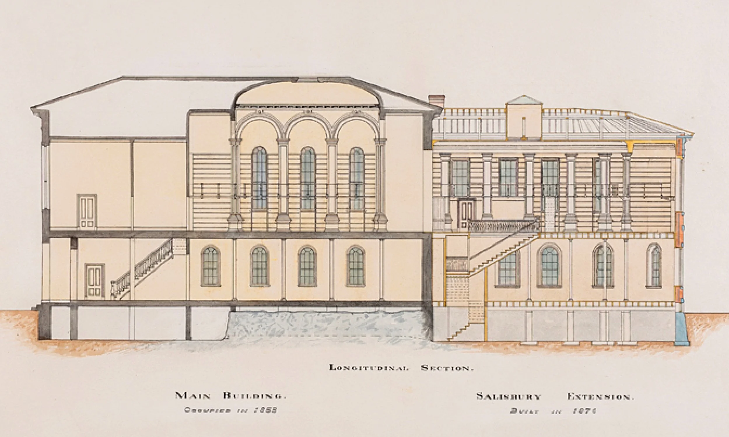
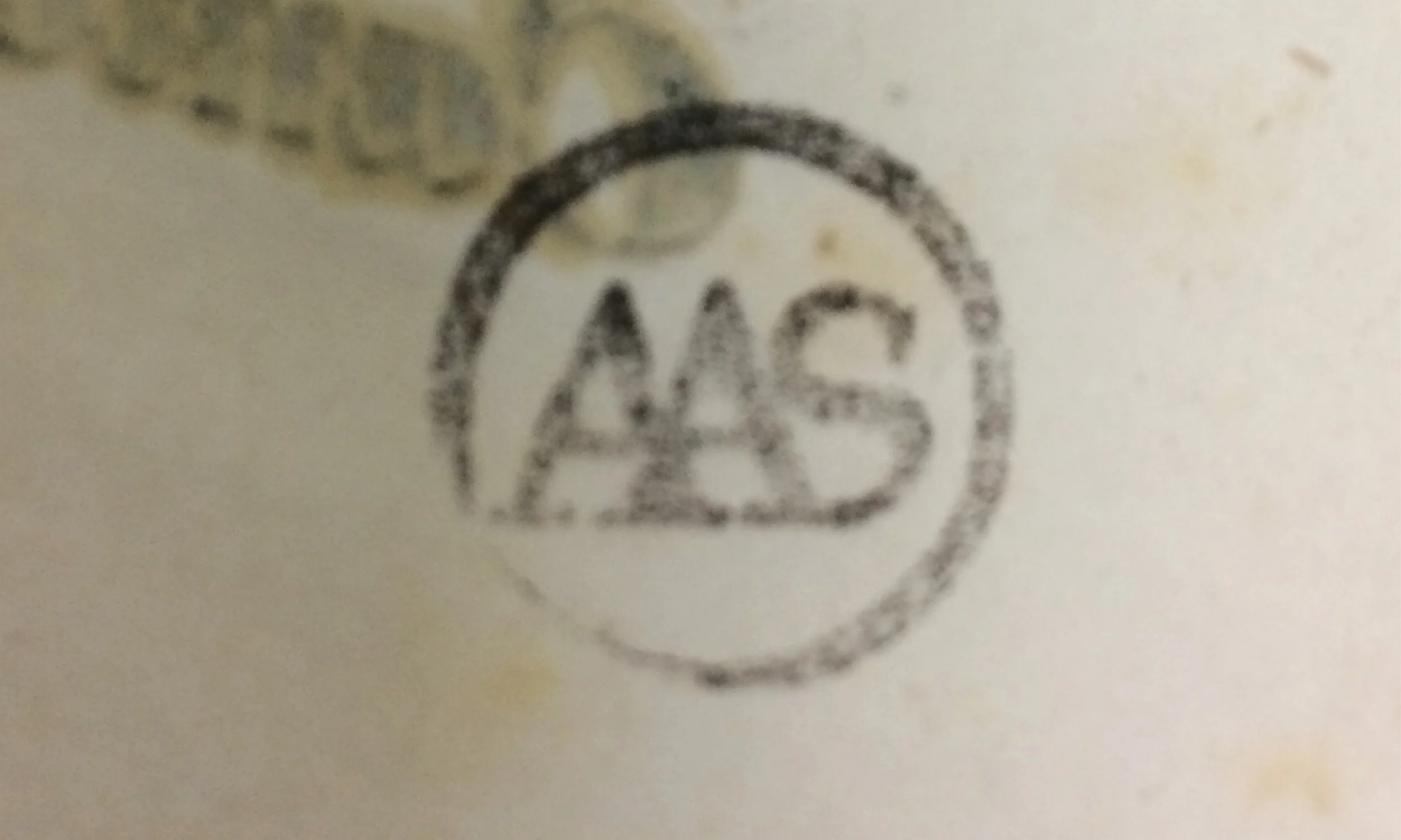
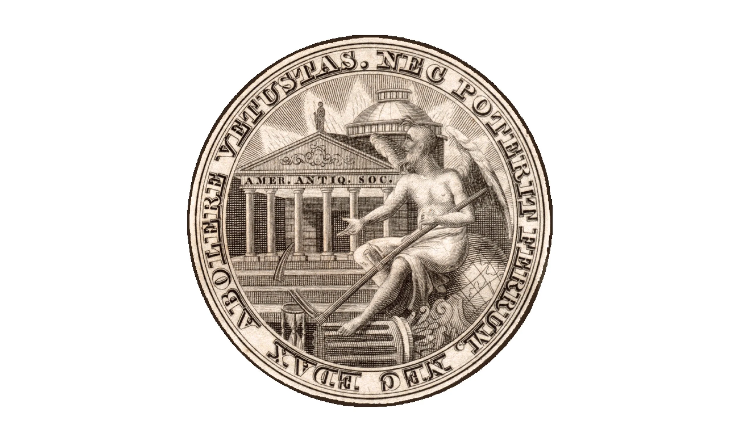
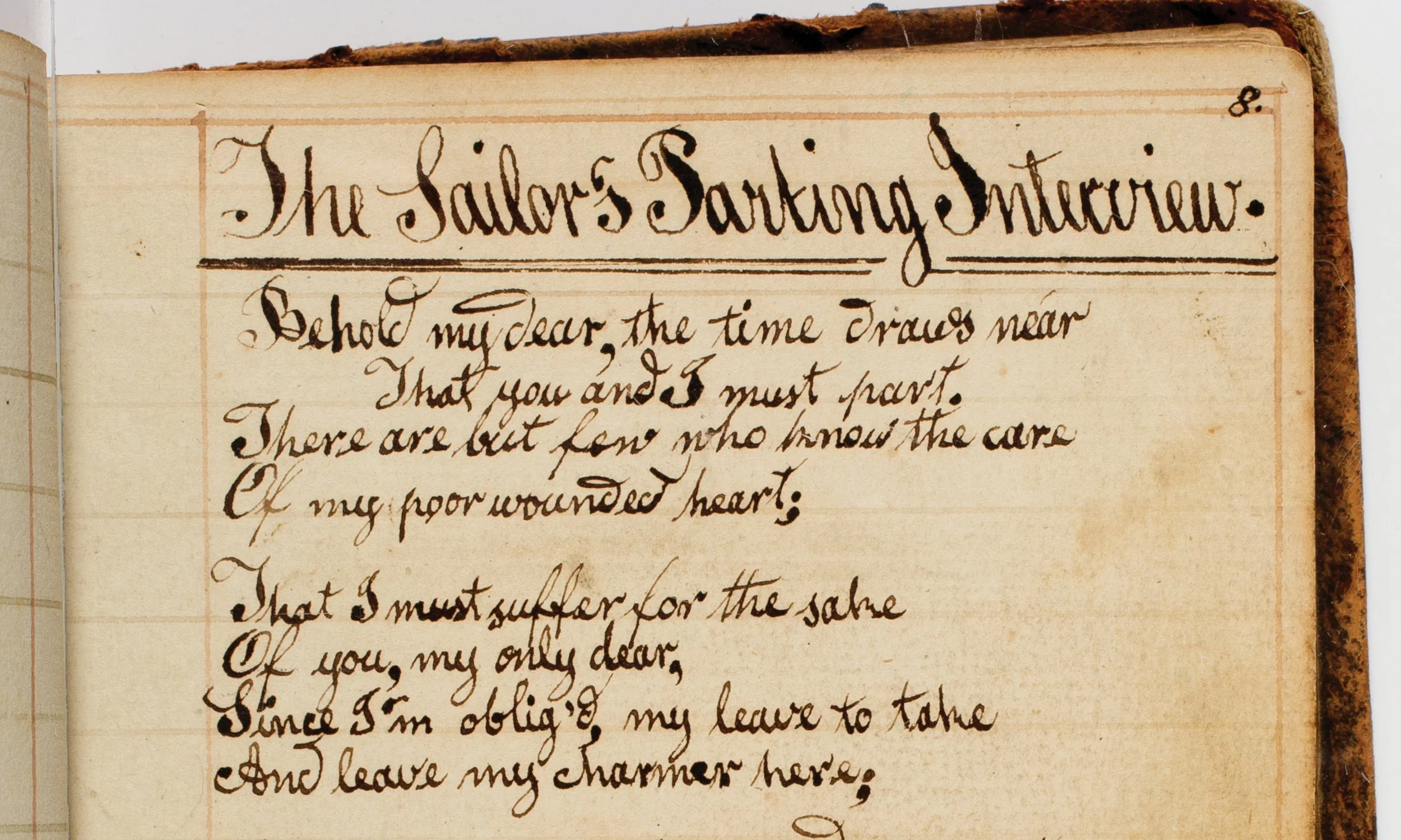
Every visual branding project begins with a careful analysis of the institution’s existing visual assets. For an organization with a rich history such as AAS, it was essential that the new identity respect and reflect its legacy. Historic materials found throughout the Society’s archives became an invaluable source of inspiration and reference during the design process.
Analysis + Research
Shown here are historic logos, book stamps, and archival marks uncovered during the research phase. These visual elements provided valuable insight into the Society’s evolving identity and served as important references throughout the development of the new brand system.
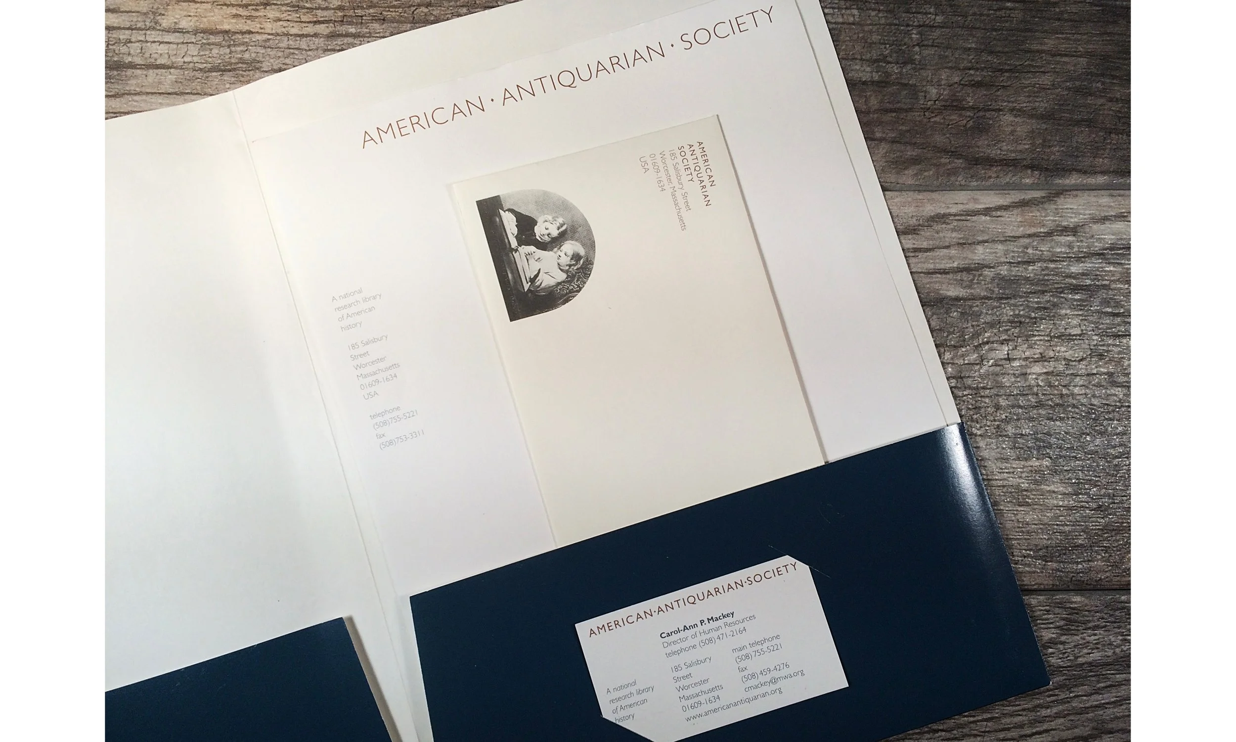
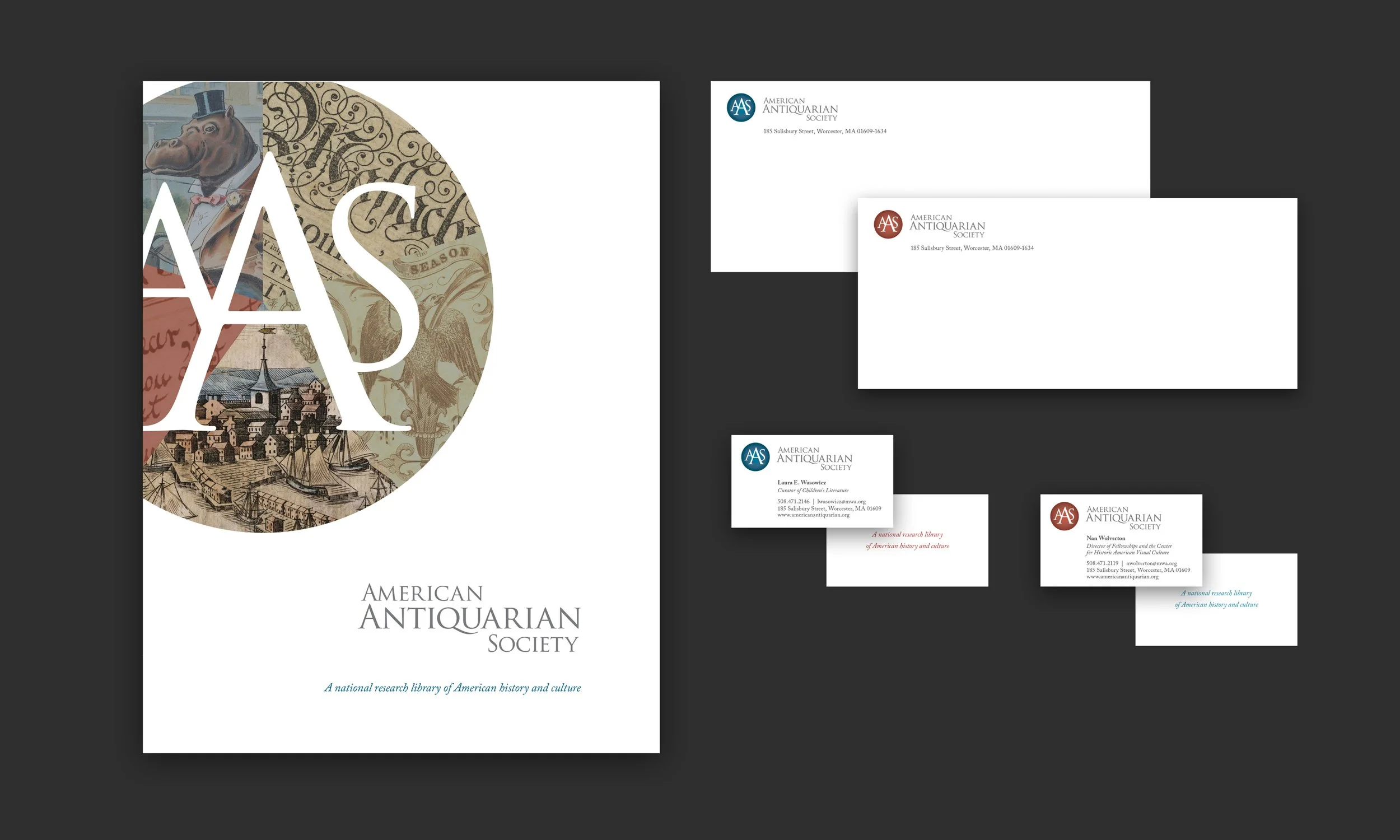
Shown here are examples of the existing letterhead, envelopes, and pocket folders, each incorporating archival images.
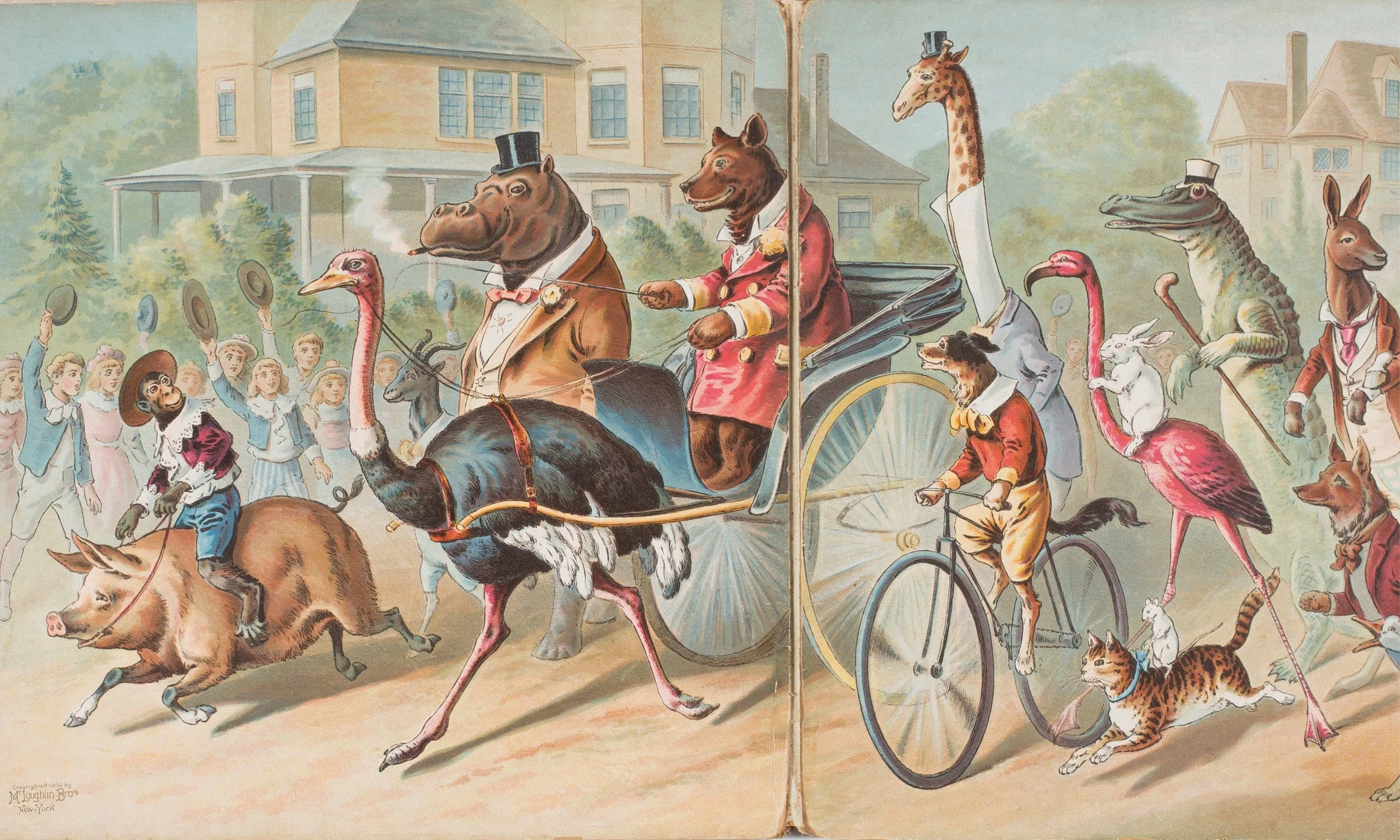
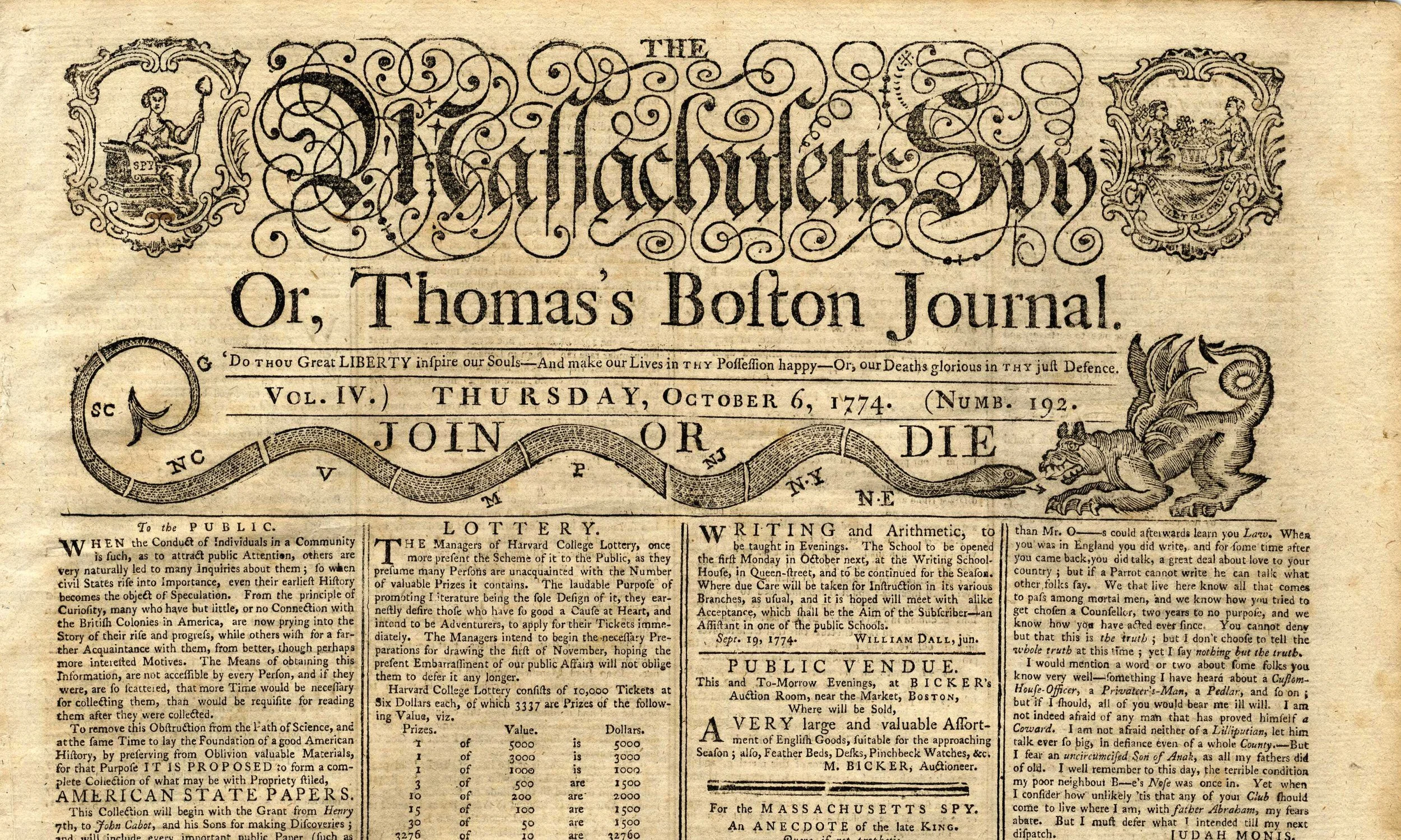
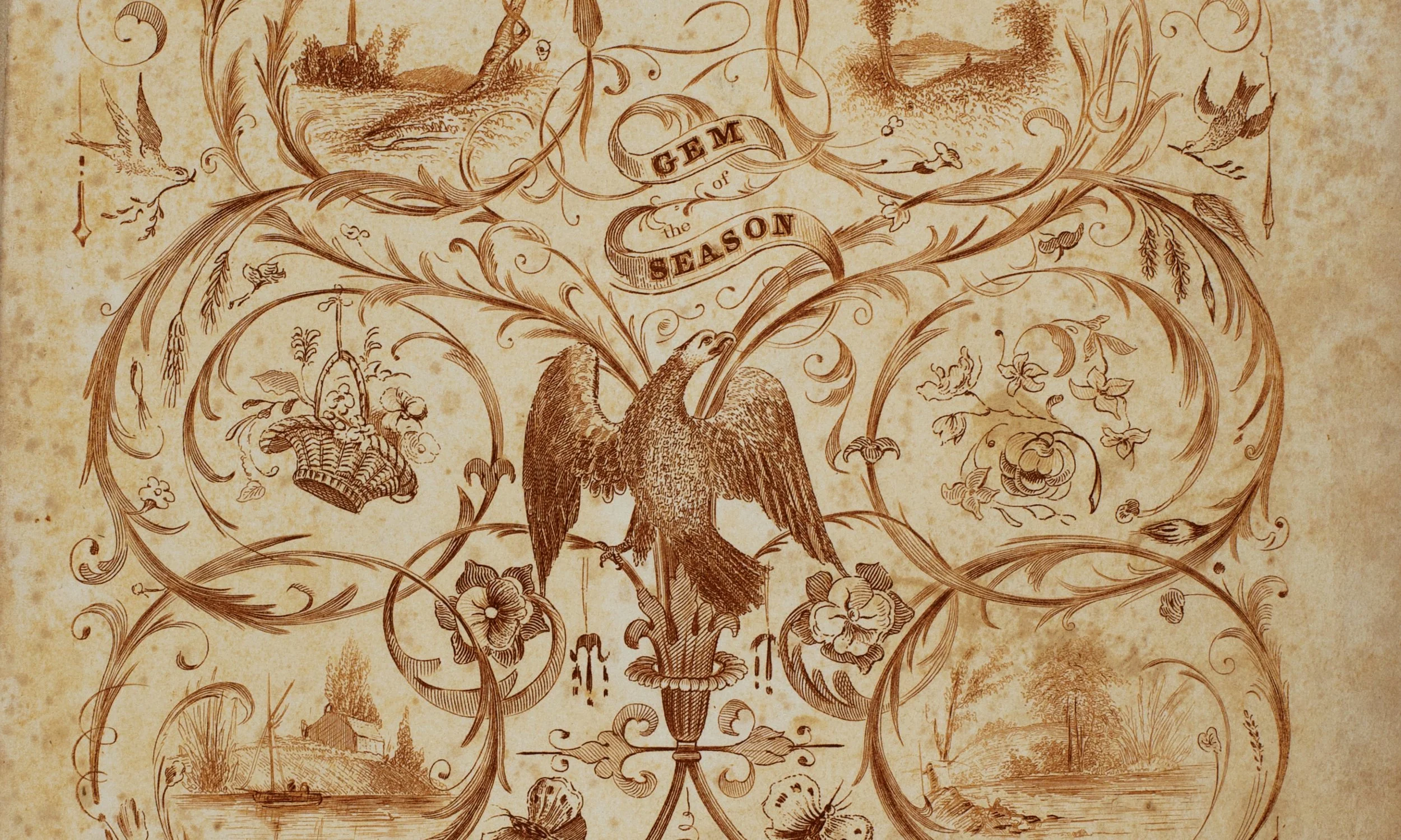
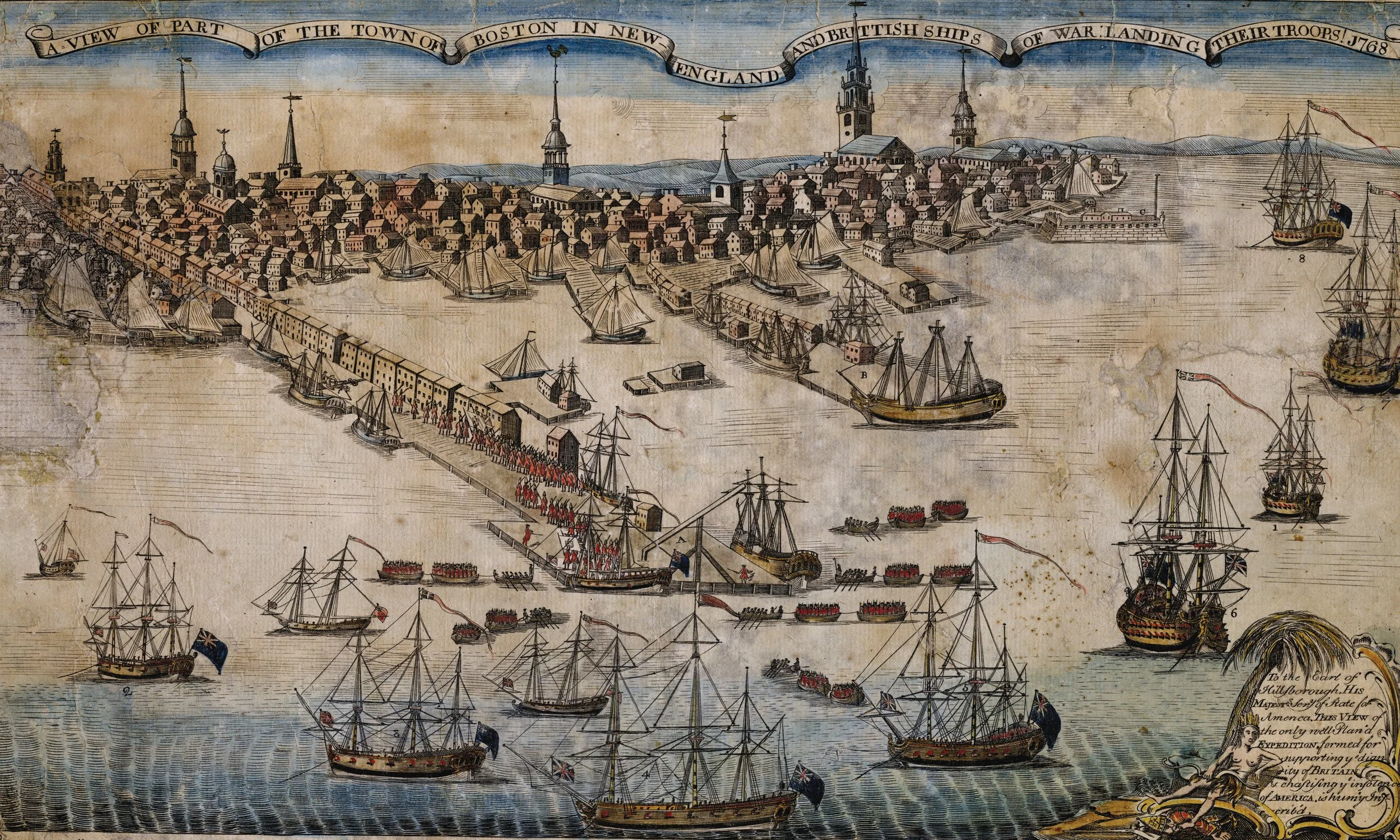
Children’s Literature
Newspapers & Periodicals
Books & Pamphlets
Graphic Arts
Manuscripts.
Discovery + Who We Are
The Society’s collections are organized into five primary categories:
Visual representations of each category were explored and developed as part of the identity system, helping communicate the breadth and depth of the collection.
The Society expressed a strong interest in using the typeface Trajan, particularly because of the distinctive character of its “Q.” The original single-line treatment had been used consistently across recent materials, but readability and flexibility became challenges across varying formats and applications.
A revised typographic approach was developed to improve legibility and create a more balanced presentation of the name. Increased spacing and refined composition allowed the typography to breathe, while the added negative space further emphasized the distinctive “Q” that had become such a valued element of the identity.
Typography

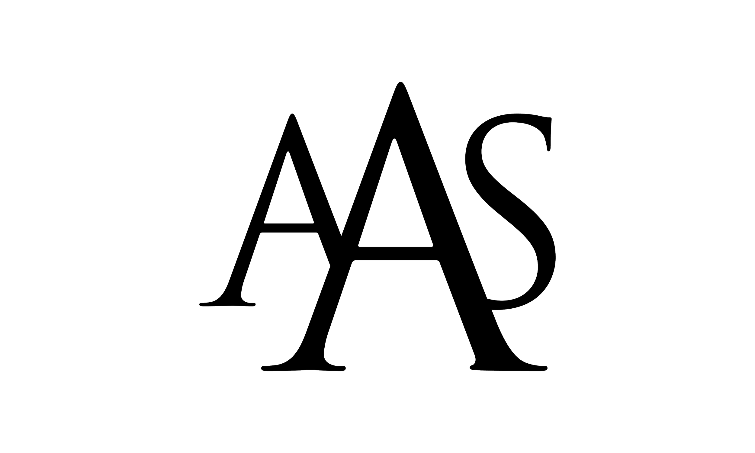
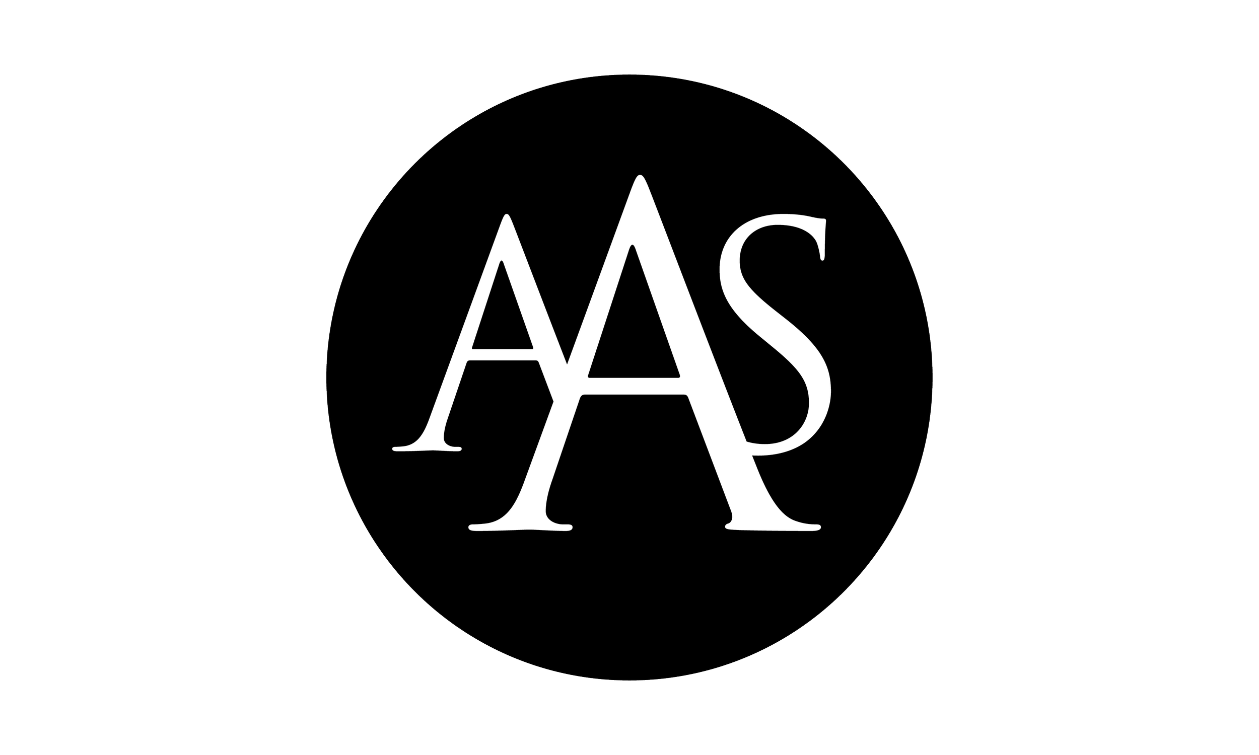
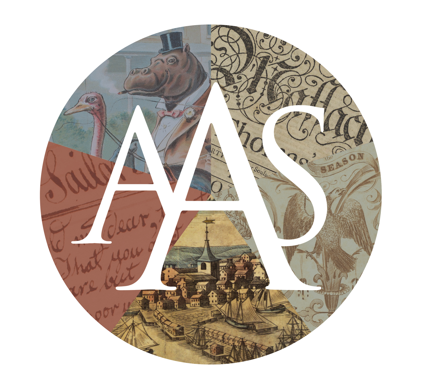
After exploring a wide range of visual directions, the final logo and wordmark system emerged from the earliest stages of research and discovery. The chosen solution successfully referenced the institution’s historic roots while introducing a cleaner, more contemporary identity.
The relationship between the mark and typography created a cohesive visual system that felt both timeless and refined. Throughout development, special attention was given to how the logo performed in black and white, ensuring strong shape, balance, and clarity independent of color.
The design solution
The color palette drew inspiration from historic reds and blues found throughout archival materials. Because most applications would appear in full color, subtle tonal treatments were introduced to create a sense of depth and age.
Darkened edges and softened color transitions helped evoke a historic quality, while the typography was intentionally rendered in a tinted black rather than a full-strength black to create a more classic and understated appearance.
Color Palette
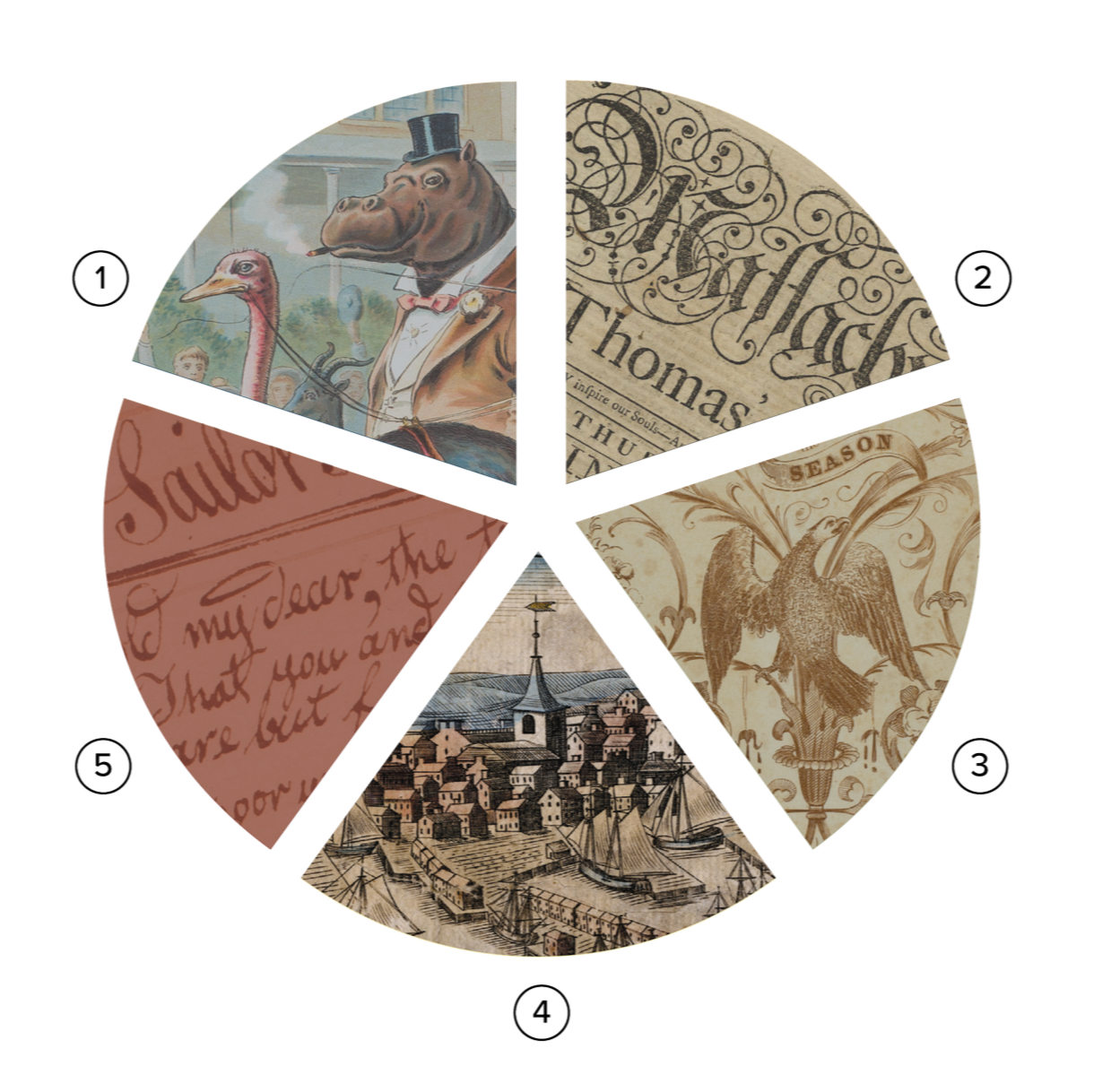
A successful identity system must function across a wide variety of applications and scales. To support larger-format uses such as banners, signage, and pocket folders, an expanded version of the mark was developed.
This variation incorporated visual references to the Society’s five collection categories, creating a more expressive and commemorative application of the brand while maintaining consistency with the core identity system.
Extended applications
Children’s Literature
Newspapers & Periodicals
Books & Pamphlets
Graphic Arts
Manuscripts
What the client had to say
Jim Casey is an exceptionally talented graphic designer. But that alone is not what makes him such a phenomenal communicator. He has that rare ability to listen, look and get the true culture of an organization and then turn that into powerful, evocative, and beautiful visuals that tell the essential story of what an institution is all about.
James David Moran
Former Vice President for Programs and Outreach
American Antiquarian Society